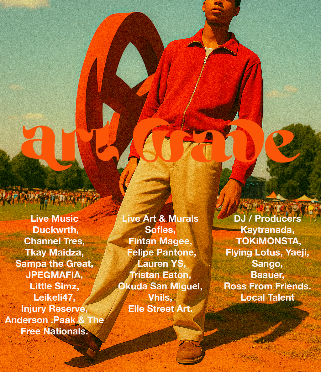
ART WAVE
Branding
.svg)


Festival branding campaign

Challenge
Art Wave is an emerging arts and music festival that celebrates creativity through a mix of visual art, performance, and sound. The festival is looking to boost its digital presence with a campaign that captures its energy, diversity, and cultural relevance. This project focuses on using strong branding, social media storytelling, and compelling content to promote the event and attract a wider audience.
Goal
Design a cohesive series of social media teaser posts and promotional assets that:
- Build anticipation and hype in the weeks leading up to the Art Wave Festival
- Showcase the festival’s bold visual identity, diverse musical acts, and immersive artistic experiences
- Drive audience engagement across platforms through creative, on-brand content
- Encourage ticket sales by generating curiosity, excitement, and a sense of community around the event
Solution
To promote the Art Wave Festival, I delivered a comprehensive creative campaign, including:
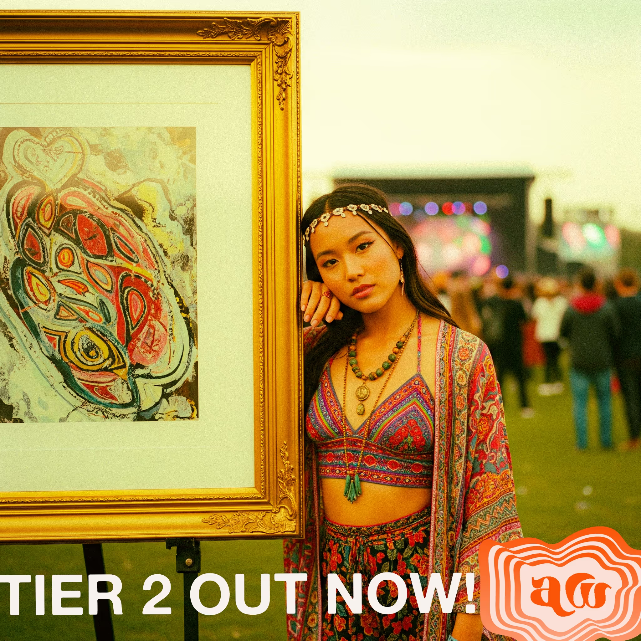
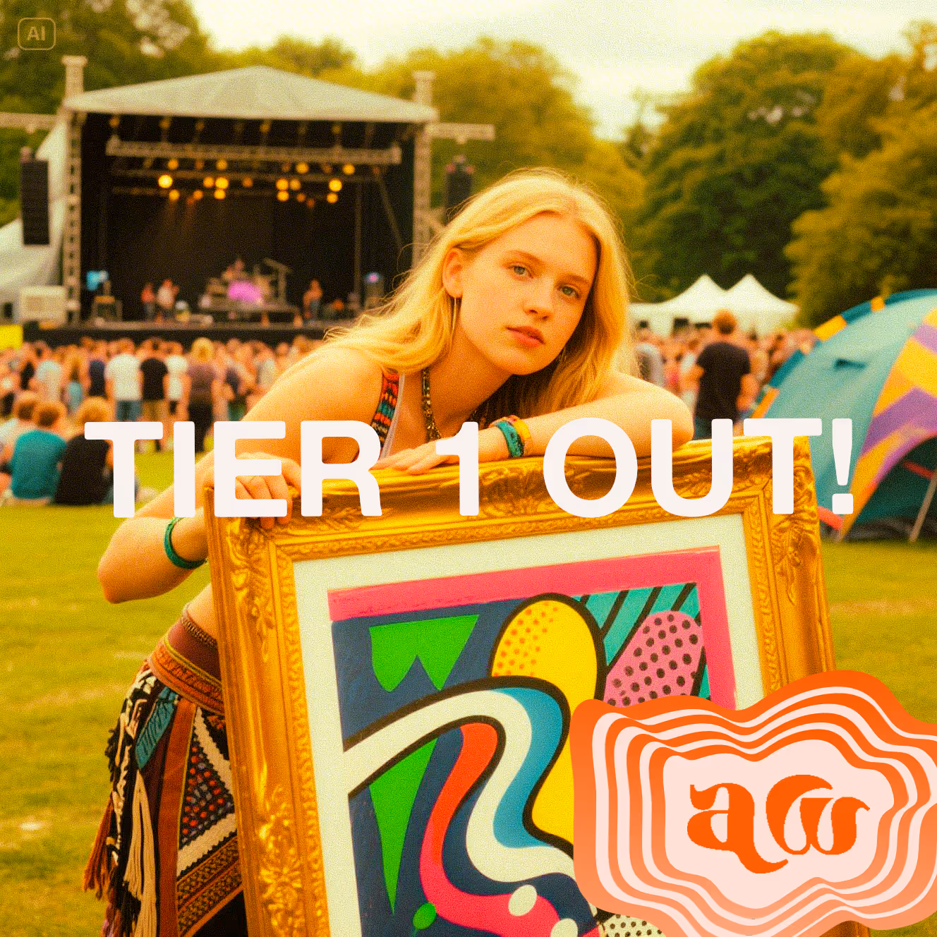
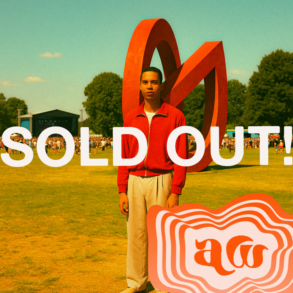
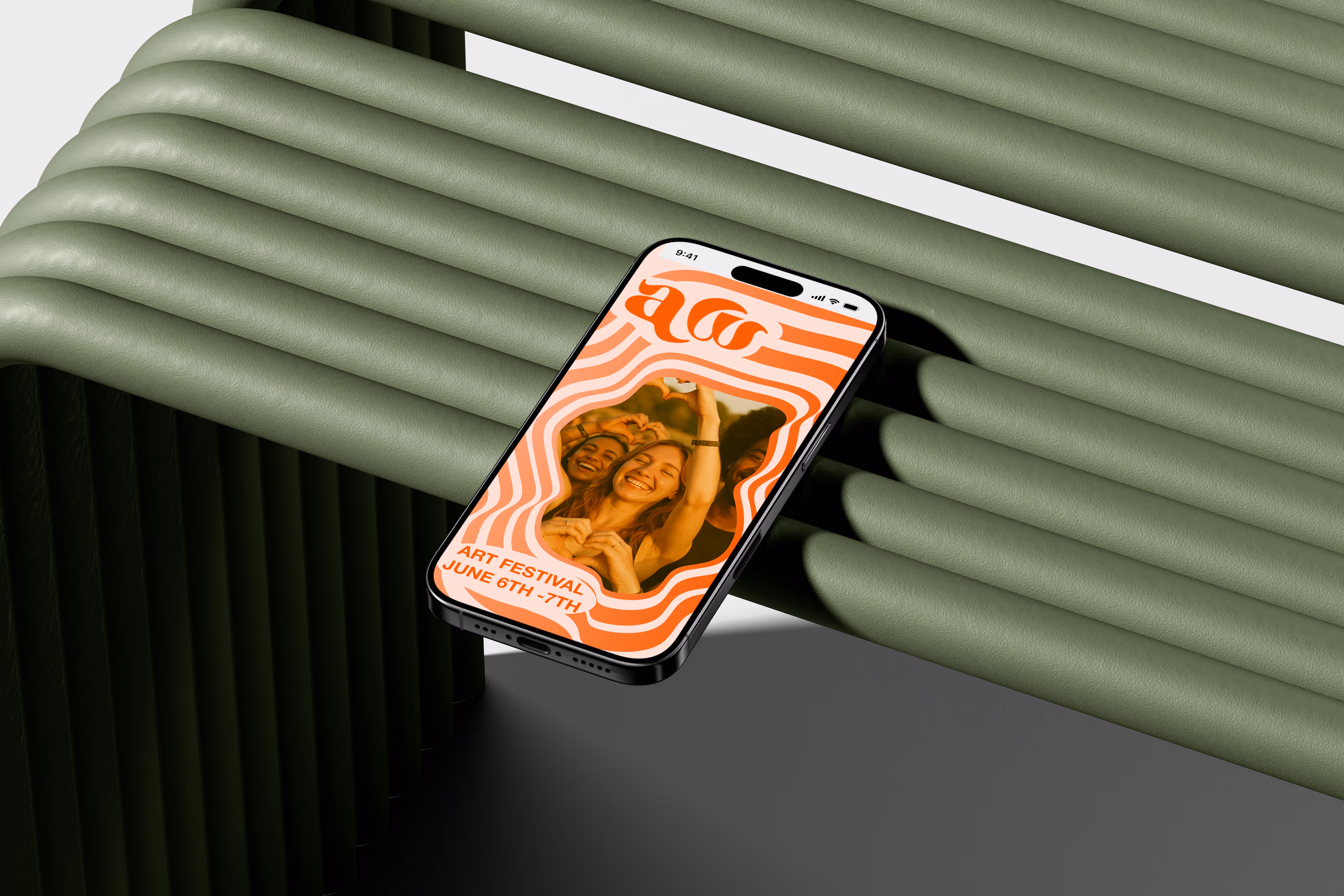
- Brand Identity: Designed a bold, psychedelic-inspired visual identity including logo, colour palette, and patterns to capture the festival’s unique vibe
- Social Media Assets: Created a full suite of Instagram posts, Reels, and Twitter content to generate buzz and maintain engagement
- Interactive Competition: Launched a social media competition to build excitement, encourage user participation, and boost organic reach
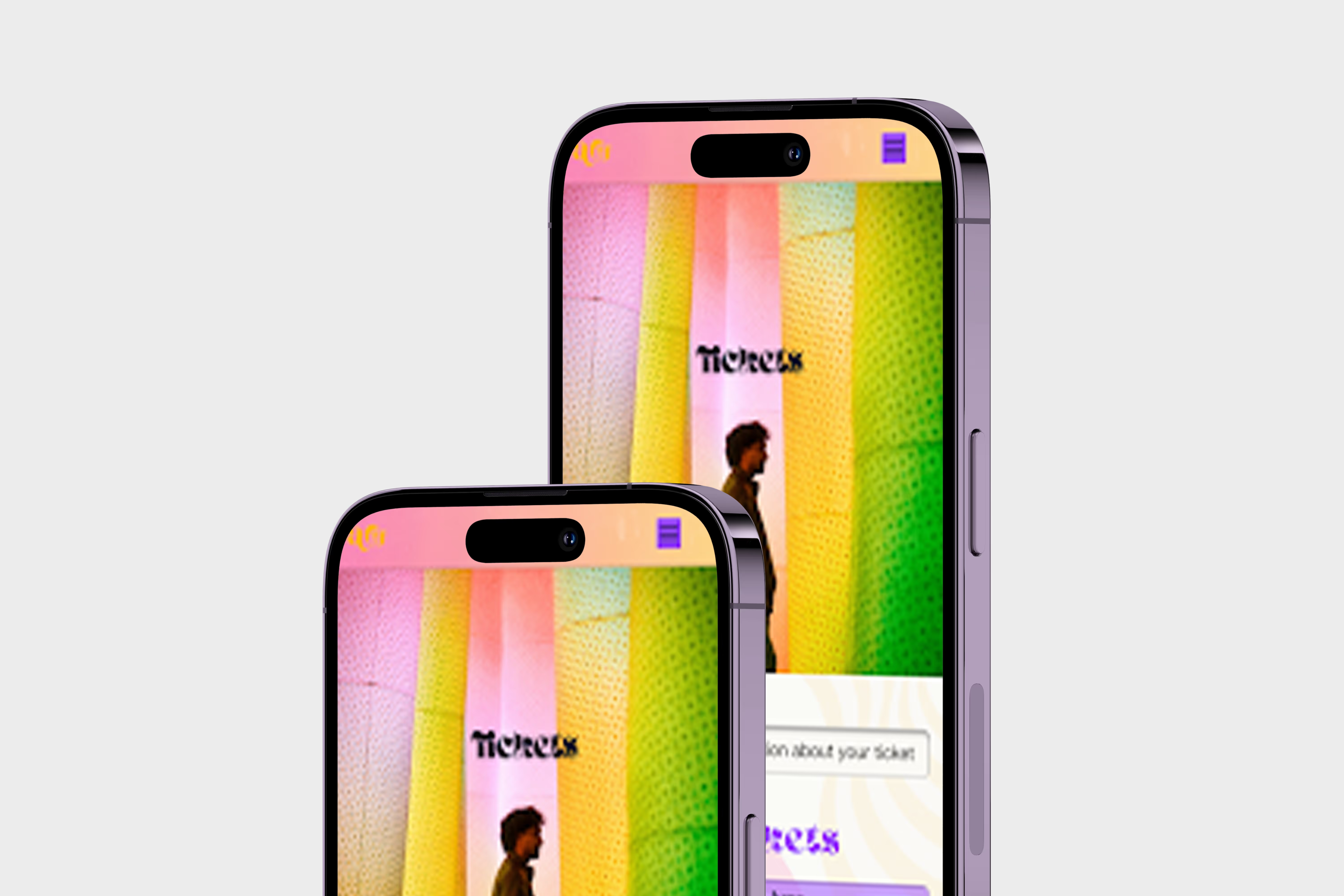
- Website: Designed a responsive and visually aligned website that provided key event information and streamlined the ticket-buying process
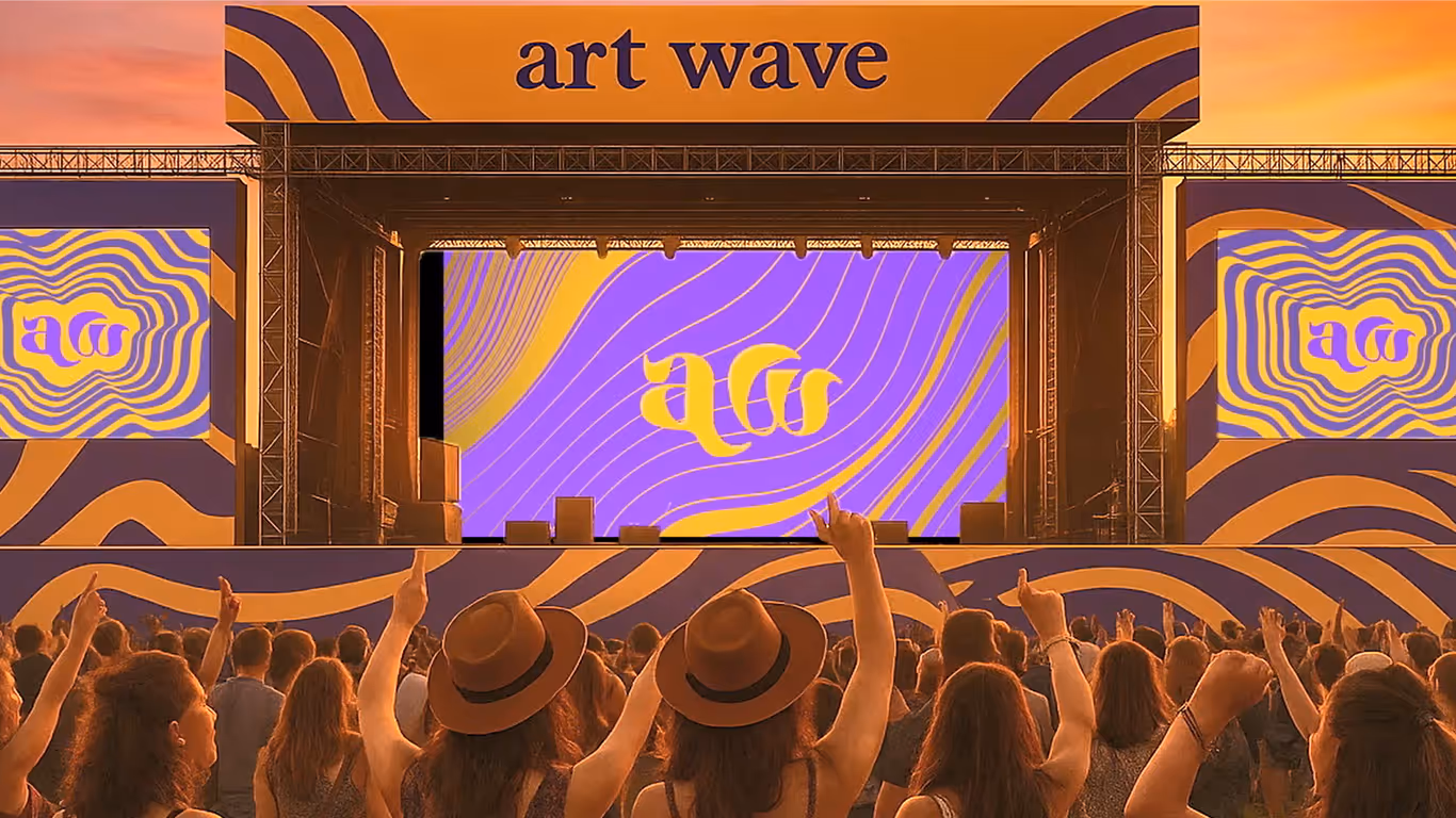
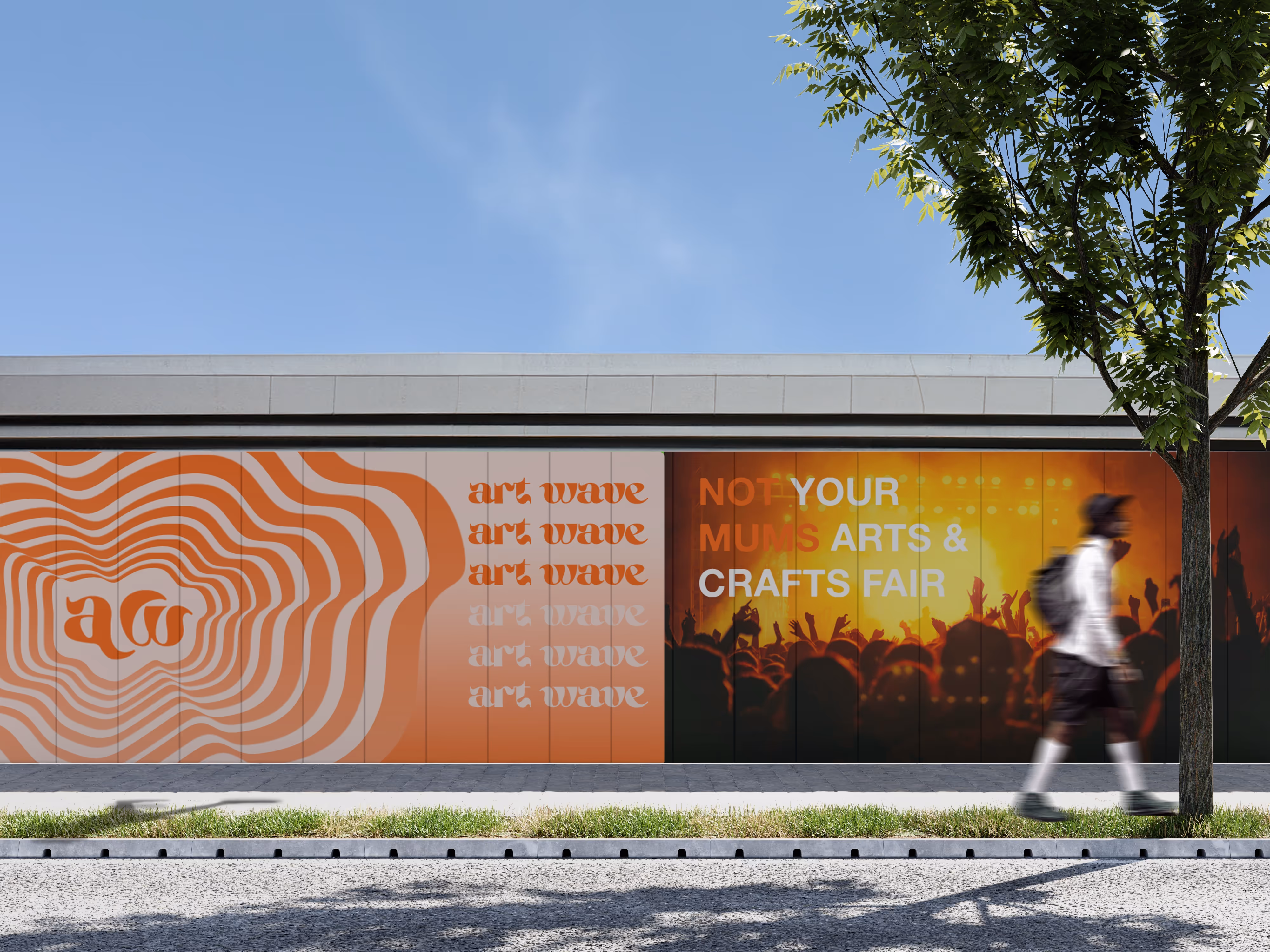
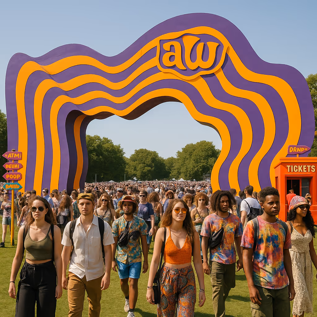
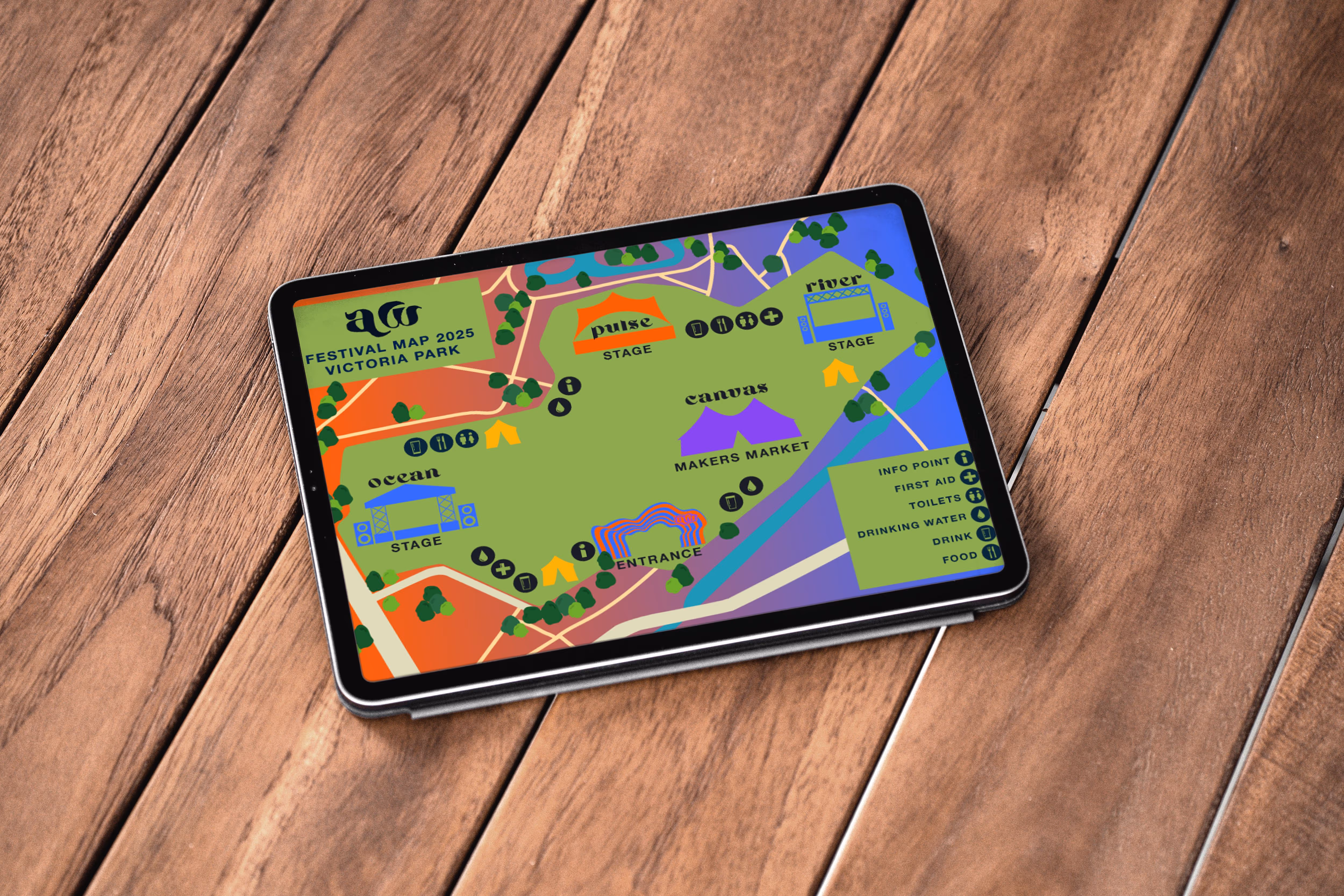
- Stage & Venue Design: Conceptualised entrance archways, stage visuals, vendor areas, and on-site signage to create an immersive festival atmosphere
- Merchandise & Promotional Material: Designed merchandise and developed a YouTube ad campaign to increase visibility and ticket sales
iNSPIRATION &
tARGET AUDIENCE
Moodboards
1. General Visual Inspiration This board gathers a wide variety of psychedelic and retro-futuristic posters, using saturated colour palettes, bold typography, and hypnotic graphic patterns. The eclectic visuals convey an energetic, experimental, and inclusive festival atmosphere. These references helped set the tone for Art Wave's identity—playful yet powerful, vibrant yet intentional—targeted at a Gen Z audience with a love for visual nostalgia and creative expression.
2.Typography & Hierarchy Study This board examines how other festivals present line-ups and information, focusing on typographic hierarchy and layout. The contrast between headline acts and supporting artists, use of grids, spacing, and clarity informed how I structured both print and digital promotional content for Art Wave. Ensuring legibility and impact across platforms was a key consideration
3.Refined Visual Inspiration From the initial research, I narrowed down a selection of standout pieces that best aligned with the desired brand tone. These designs strongly influenced the final aesthetic, particularly through their use of warped typography, flowing compositions, and bold, warm colour gradients. They embody a sense of movement and sound, making them ideal for a dynamic, music-focused event
4. Competitor Research I explored the branding, digital content, and marketing strategies of existing music and arts festivals. This analysis helped identify common trends—such as muted palettes, modular layouts, and minimalistic navigation—and areas where Art Wave could stand out, particularly through more expressive graphics and interactive digital features.
.svg)
.svg)
Personas
Our content strategy will be deeply informed by these insights. For Alison, this means leveraging user-generated content, showcasing emerging artists, and utilizing platforms like TikTok and Instagram for dynamic, short-form video. Conversely, Arnold's preferences guide us towards rich storytelling, high-quality visuals, and informative content on platforms such as YouTube and X, focusing on the unique aspects and deeper narratives of the festival.
Ultimately, these personas enable us to address specific motivations and alleviate potential concerns. We'll emphasize community and discovery to resonate with Alison's drive for connection, while highlighting the festival's outdoor setting and opportunities for shared experiences to appeal to Arnold's desire for new inspirations and quality time. This targeted approach ensures our brand and social efforts are both impactful and authentically engaging for all attendees. Generate Audio Overview
COLOUR & TYPOGRAPHY
Main Colour Schemes
For this festival I am working with a bold, vibrant colour palette perfect for making an energetic, expressive visual identity. Here's a breakdown of how to strategically use each colour in the palette for design work:
Warm Yellow Cheerful, energetic Vivid Orange: Bold, Youthful, Attention Hot Pink Playful, Expressive Bright Blue: Reliabious. Digital FriendlyElectric Purple: Creative, Edgy, Bold. Black , navy and off-white will be used as secondary colours . To create a worn and vintage affect these colour temperatures will be altered in some designs.
ALTE HAAS GROTESK
AHSING
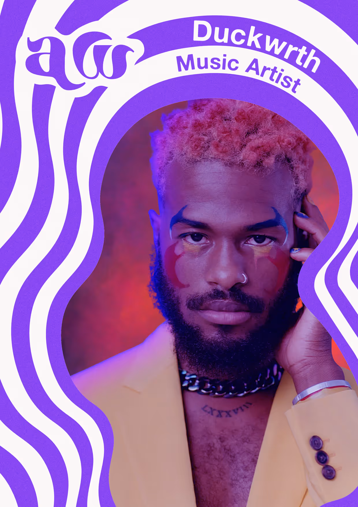
Logo


LOGO APPLICATIONS
Using the colour and logo guidelines I can create various branding applications that align with the guidelines I have set out.
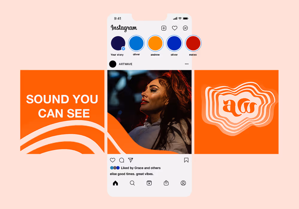

online branding
TikTok – Real, Raw, and Relatable
The digital campaign is the beating heart of Artwave — the driving force behind how we connect with our audience, build excitement, and tell the story of the festival. At its core, it’s made to speak directly to Gen Z: bold, creative, and always online.
Our strategy spans TikTok, Instagram, YouTube, and a dedicated website, with a carefully curated content calendar to keep the energy alive before, during and after the event. It’s not just marketing — it’s an experience in its own right.
TikTok – Real, Raw, and Relatable
Fast-paced and unfiltered, TikTok is where we tap into trends, showcase artists, and create authentic, behind-the-scenes moments that bring Artwave to life. Expect short, sharp, scroll-stopping content: creative challenges, mini-docs, transformations, and on-the-ground festival moments designed to be shared, stitched, and reimagined by the community.
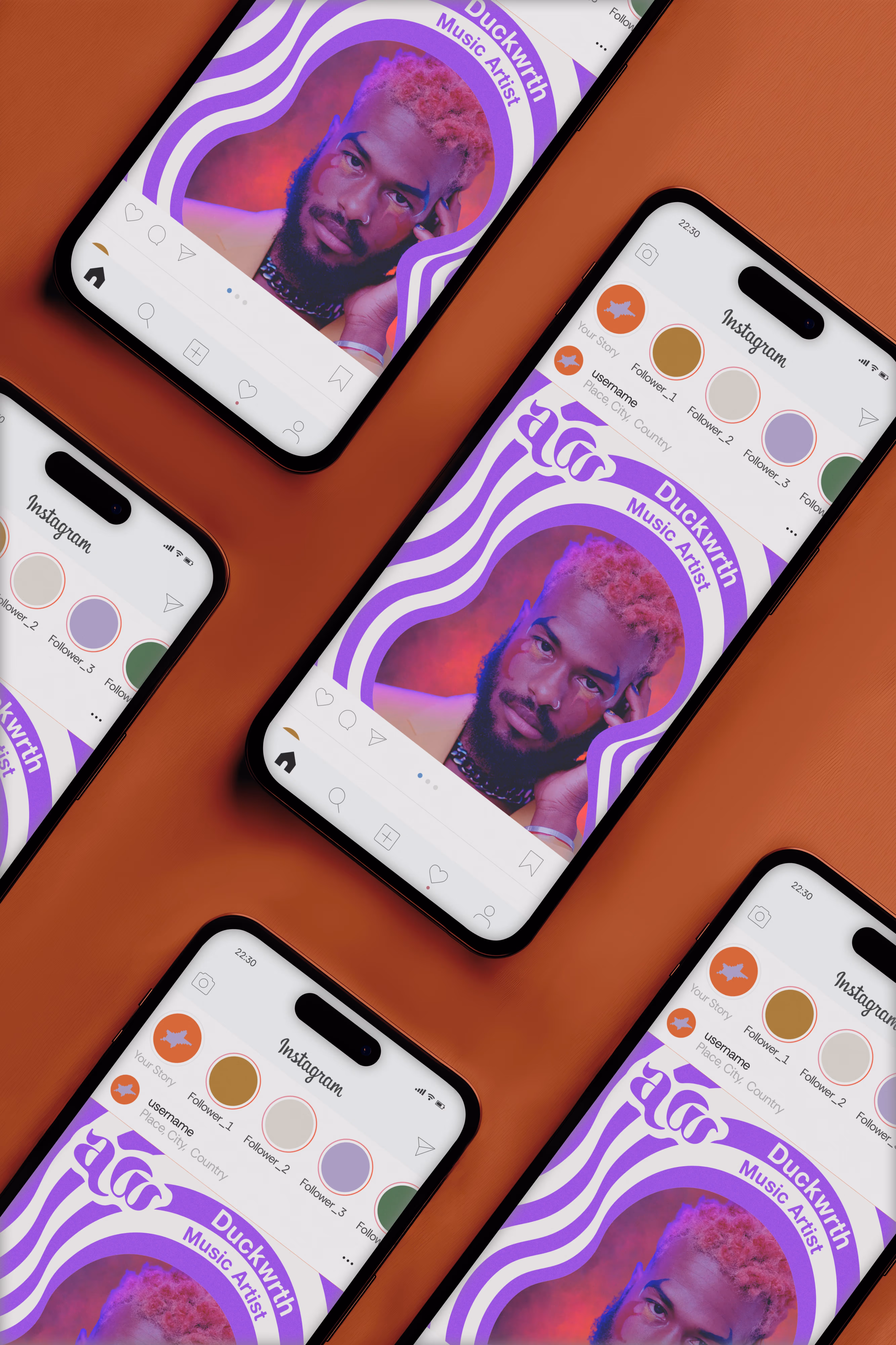
Instagram Carousels & Reels – Visual Storytelling That Sticks
Instagram is our digital gallery. We’ll use carousels to spotlight artists, breakdown installations, and give bite-sized previews of what to expect. Reels give us a chance to remix our TikTok content for a slightly different crowd — aesthetic, trend-aware and eager to discover. Think reels that make you stop, watch, and share — whether it's a time-lapse of an artwork, a festival highlight, or an artist's voice note.
YouTube – Longer-Form, Deeper Dives
YouTube hosts our longer-form content — think artist interviews, creative process features, mini-documentaries and behind-the-scenes tours. It gives space for those who want to go deeper, exploring the thoughts, themes, and talents that shape Artwave.
Festival Website – Your Digital HQ
More than just a schedule, the Artwave website is an evolving hub. It houses links to all our content, hosts artist profiles, features live feeds from Instagram, and showcases entries from the contest. It blurs the line between digital and physical, turning every online interaction into part of the festival experience.
Social Calendar – Building Buzz, Day by Day
A planned but flexible content calendar keeps the momentum flowing — from countdowns and teaser trailers to real-time updates and reaction reels. We’ll adapt to what’s trending while staying true to our voice, ensuring there's always something fresh to discover.
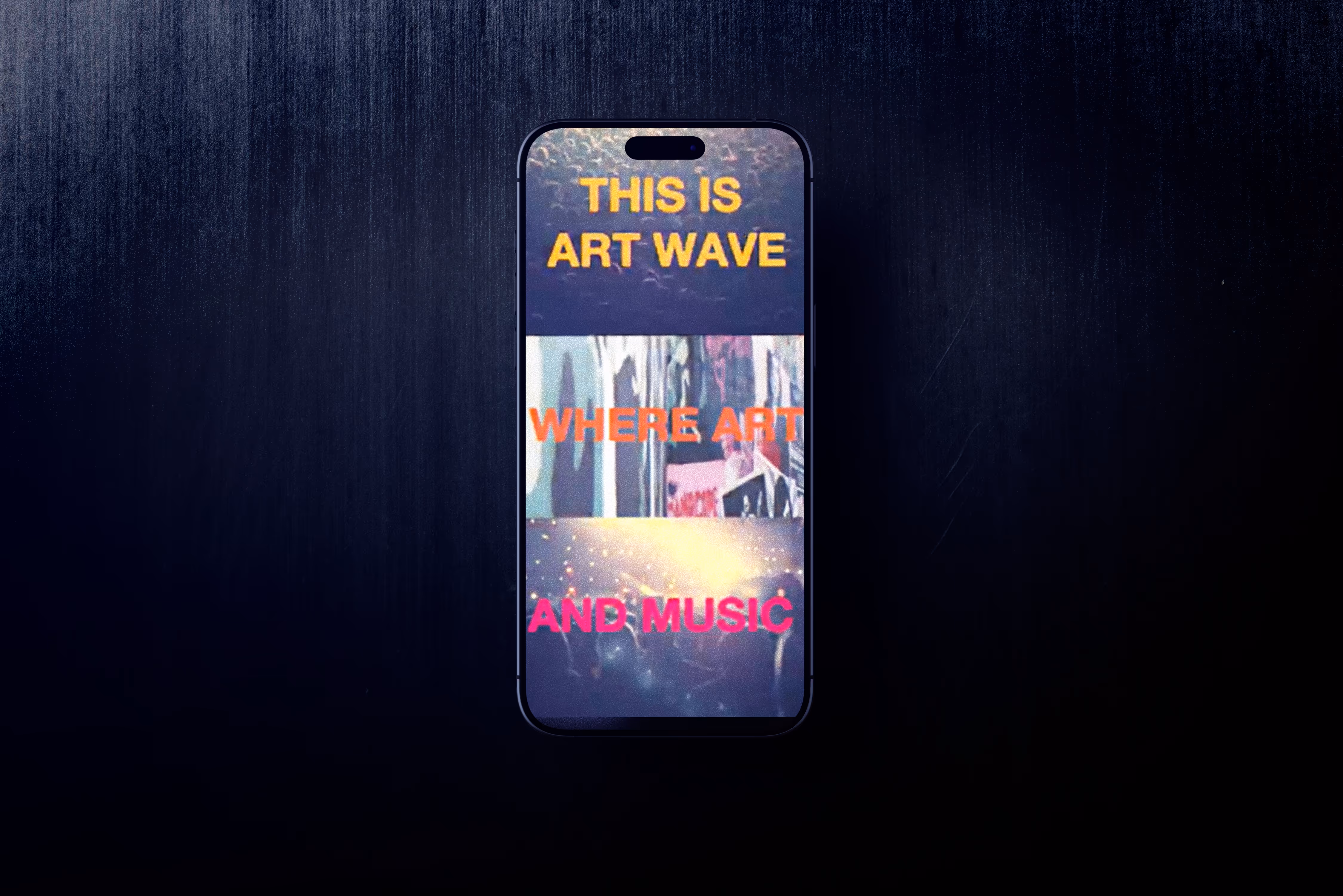
Youtube Promo
Social posts