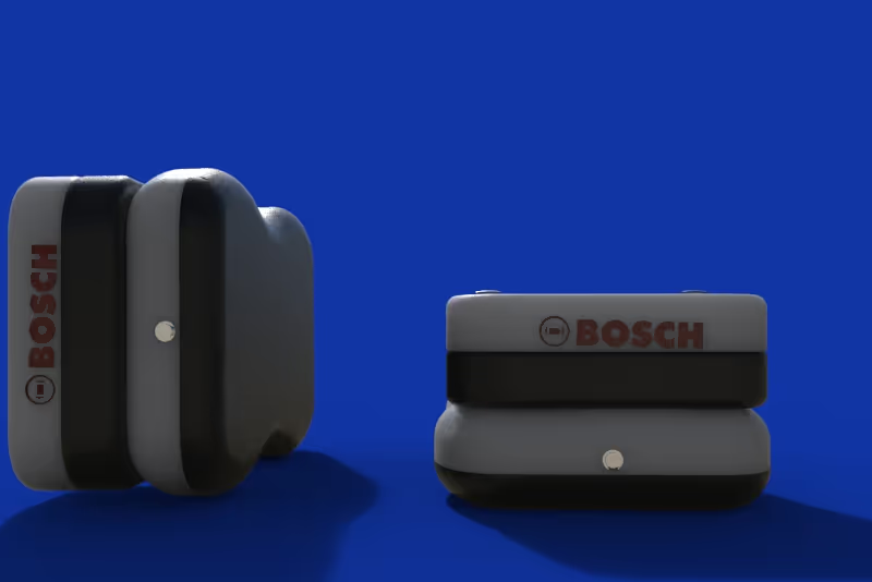
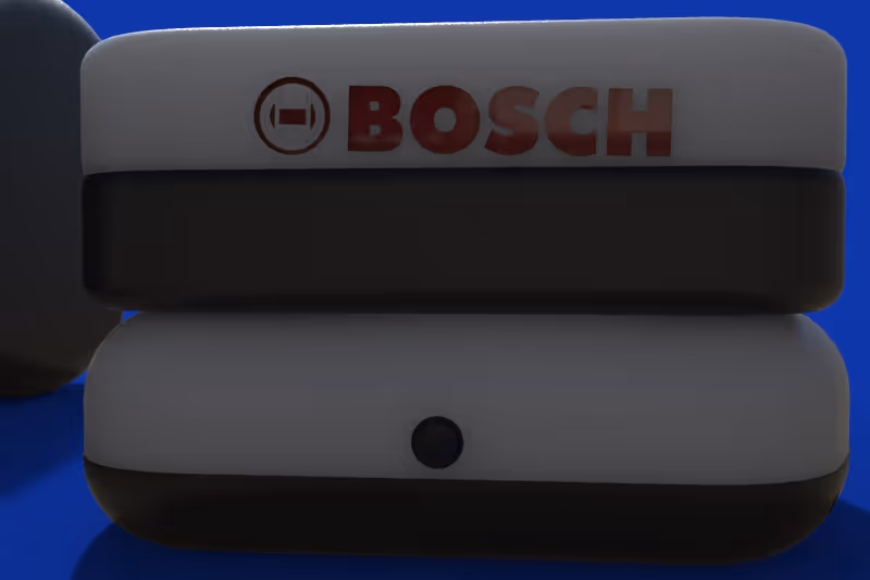
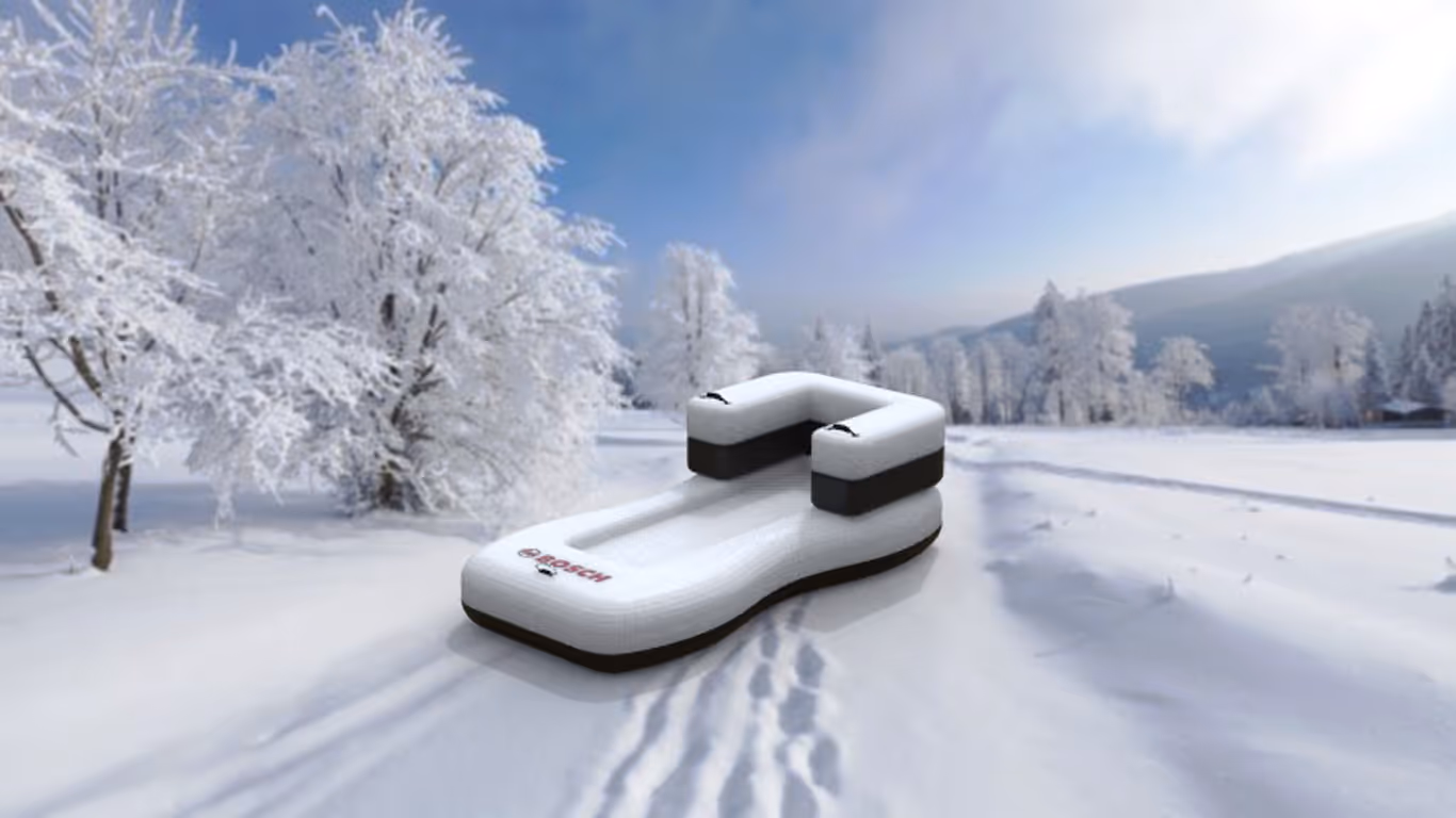
BOSCH: SLEDGE
PRODUCT EXPANSION
BRAND LANGUAGE
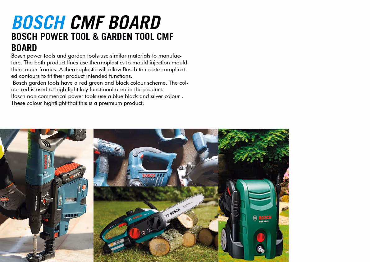
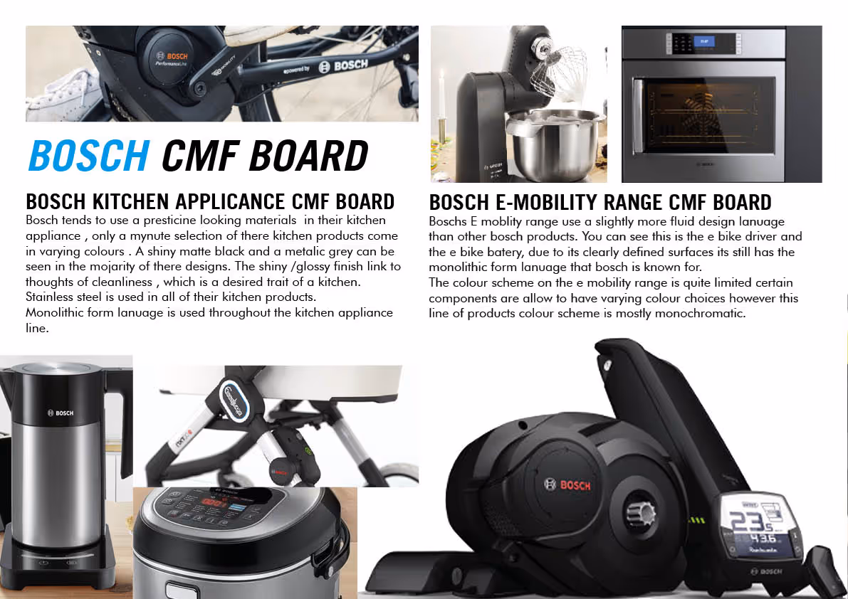
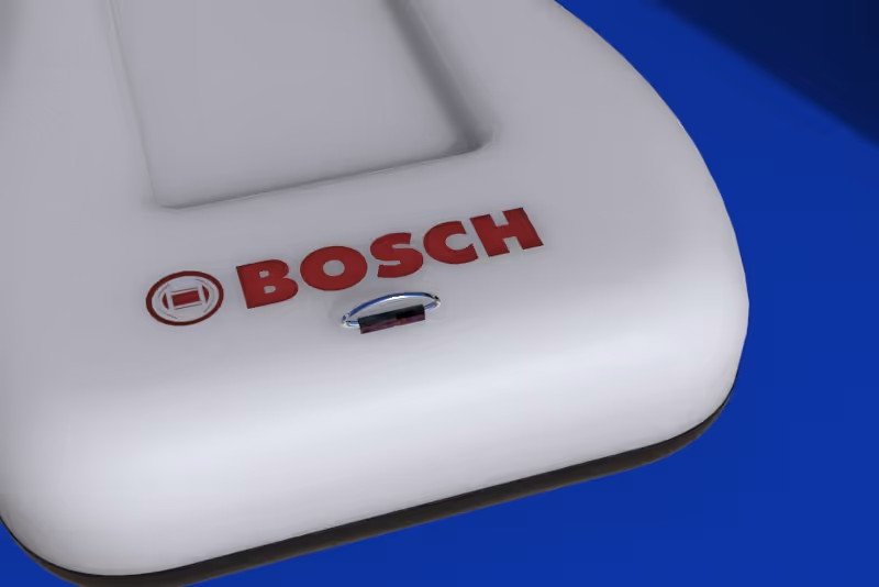
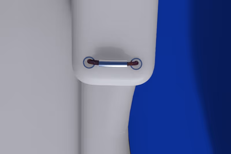
Bosch has a variety of products in many different sectors of consumer goods however there are the a few design features that each of their products follow that allow them to fit in their broad brand context .Logo visual structure- In all of Bosch products the logo is always plastered central to the products form, the logo will act as a center of focus on the product due to this; sub-consciously telling us of the brand importance in relation to the product. Monolithic styling choice- Bosch design use a monolithic style of to embolden their products them look sleek. Colour pallet- Bosch products come in a large range of colours however there a certain colour combinations that are used more often. Bosch bikes and drivers use combination of black white and cyan (Red is used in the logo to make it seem more prominent). Their kitchen appliance use a silver , glossy black and white. Commercial power tools are red green and black, whilst new commercial tools use blue black and rend Logo placement- logo is place in area that does not move regardless to hoe the actual product interacts. Red is used to indicate switches- red is used a universal colour for hazards many of the control potentially harmful are red. Contour bias- Bosch products tend not to have any sharp and abrupt vertexes and have a rounded design .
SKETCHES
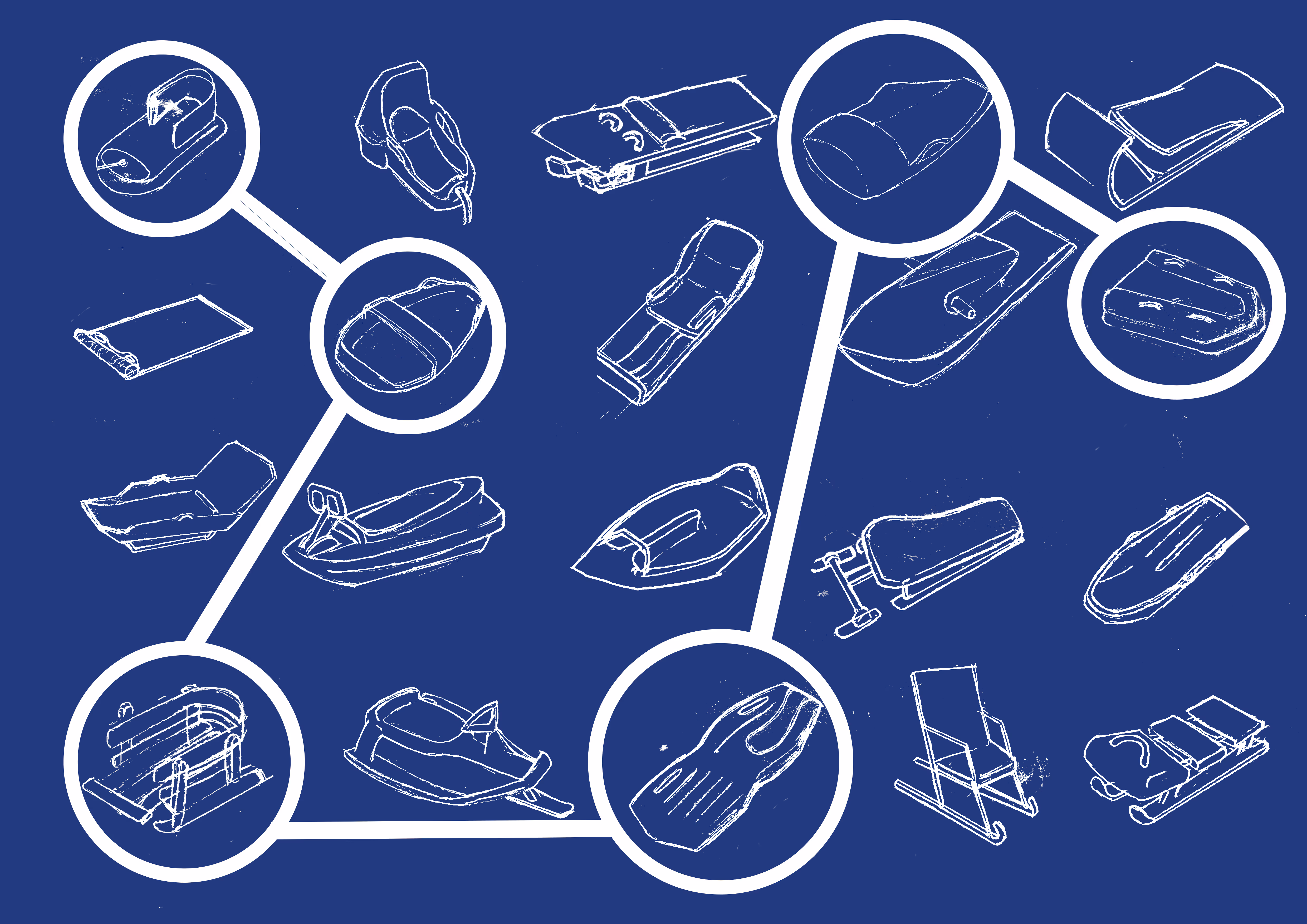
To start the design process, I drew some snow sledge designs, taking inspiration from the existing products in the market today.The highlighted thumbnails are the thumbnails that I chose to develop into concepts.
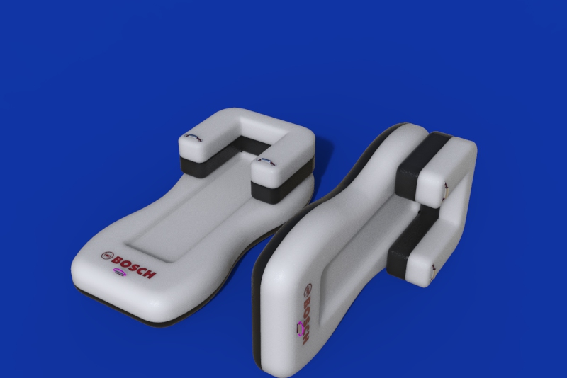
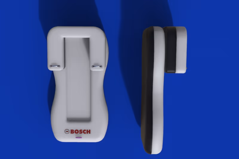
FINAL VISUALISATION