
posterzine®


Visualizing the Intangible: Posterzine Licensing Launch

Challenge
People of Print wanted to launch the commercial licensing of their signature Posterzine® format. The challenge was to present Posterzine not just as a print product but as a flexible, marketable format with applications across industries, while making the licensing proposition clear and attractive to potential brand partners and agencies.
Goal
To design a digital toolkit and promotional assets that:
- Demonstrated the adaptability of Posterzine across different industries.
- Clearly communicated the benefits of licensing the format.
- Supported outreach by providing an engaging and informative licensing guide.
- Positioned Posterzine as a desirable medium for creative campaigns and brand storytelling.
Solution
To create a cohesive digital toolkit that translates Posterzine’s tactile, print-based identity into a dynamic digital experience. The focus is on maintaining brand authenticity while adapting the aesthetic for digital engagement.
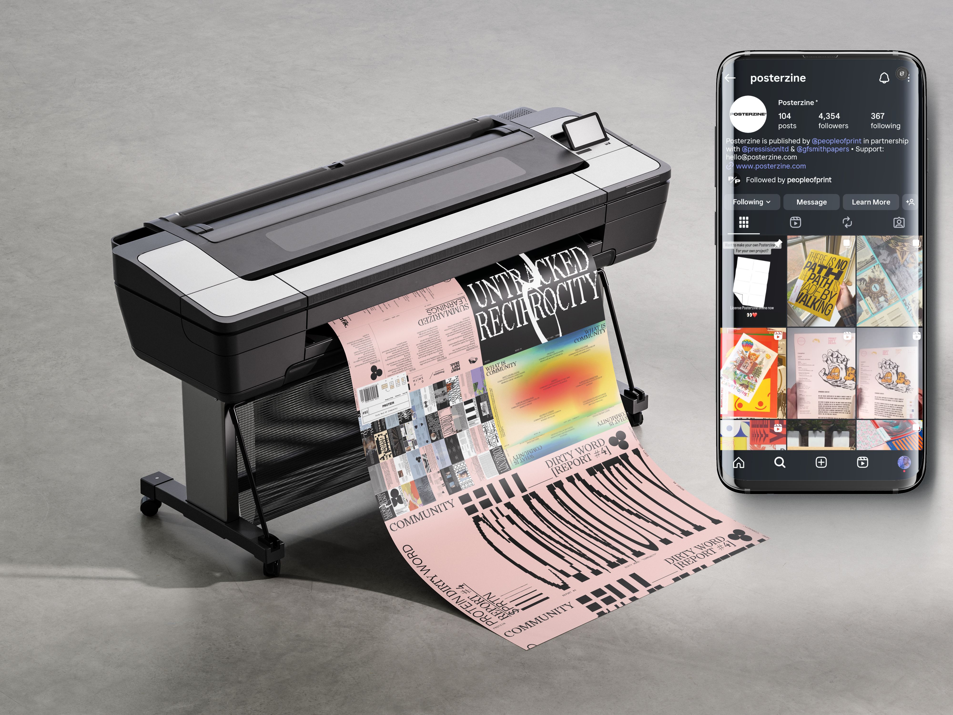
- Branded mockups showcasing how Posterzine’s visuals and licensing assets could be applied across digital and print contexts.
- Social media carousel and story assets designed to promote the Licensing Launch across multiple platforms with visual consistency.
- Lightweight licensing guide (PDF or landing page) providing clear, accessible information for potential partners.
- Unified visual system that balances Posterzine’s editorial style with a digital-first design approach, ensuring recognisability and engagement across all materials.
what is posterzine® ?
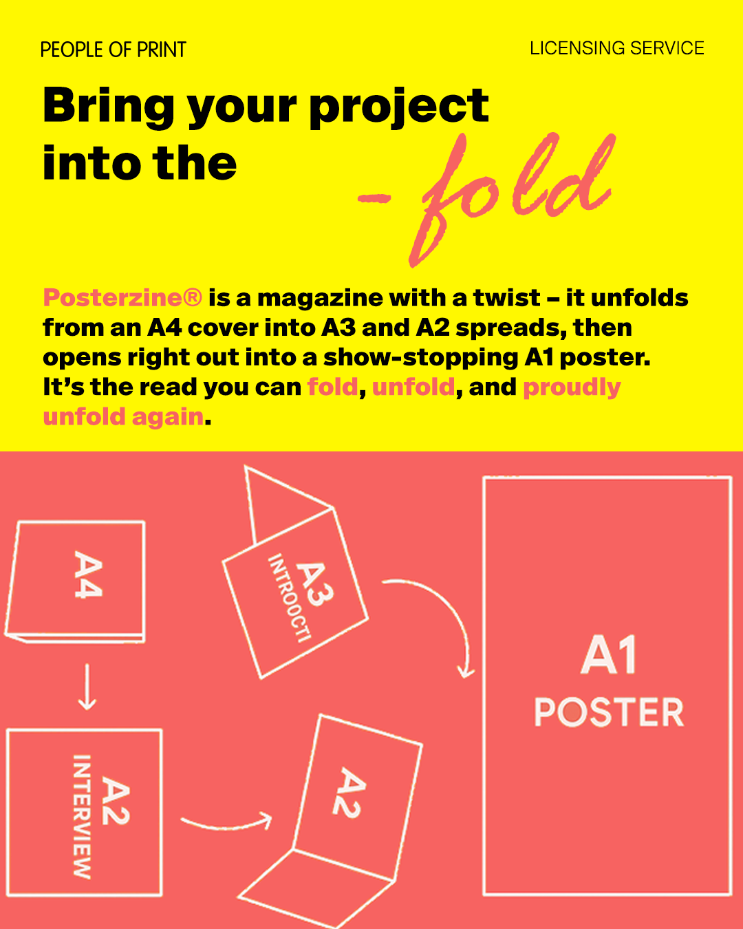
Posterzine® is the only poster in the world that is registered with the British Library as a magazine. It folds out from A4 into a massive A1 print. Published byPeople of Print (In Perpetuum)in partnership withPressision & G.F.Smith.(Multiple poster and zines in one)
Posterzine® offers a well-curated selection of artists and designs. Customers appreciate the friendly and supportive service from the Posterzine team. Quick delivery and a wide variety of choices make shopping enjoyable.
Launched nine years ago as a creative solution to an editorial space challenge inPrint Isn’t Dead™ Magazine, Posterzine® quickly captured the imagination of art lovers and design enthusiasts alike. Each monthly issue features a different artist or designer, presenting both a visually striking poster and an in-depth, exclusive interview with the creative behind the work.
Unique Format
.png)
Format: Posterzine
A collectable A1 poster that folds into an A4 magazine.
This format combines editorial and visual design to create a distinctive, collectable publication. The layout achieves a dynamic balance between content and imagery, encouraging both visual engagement and readability.
Visual Style (≈ 65%)
The design is primarily image-led, featuring bold illustrations, vibrant colour blocks, photography, and graphic artwork that dominate the layout. The composition feels free-form and collage-like, creating an expressive and artistic tone rather than a structured or corporate one. These visuals act as the main storytelling element, instantly engaging the viewer and appealing to creative audiences.
Editorial Content (≈ 35%)
Text is typically placed along the margins and within the white space between visuals. The typography is clean and legible, supporting the artwork rather than competing with it. Editorial content usually consists of short interviews, commentary, or descriptive text—concise and well-edited to match the tone and pace of the visual design.

Main Colour Schemes
Vibrant, saturated, and unapologetically loud—expect bright pinks, yellows, blues, neons. Colours are curated per feature, with the palette often echoing the visual style of the artist or collaborator. White space is still used strategically to let designs breathe.
Sussie
sample Issue Commision
Strategic Curation: Selecting the Sectors
While Posterzine inherently leans toward the fine art and graphic design world, I needed to prove the licensing format's versatility to entirely new commercial audiences. I deliberately selected Architecture, Branding/Identity (using a culture-driven agency like Porto Rocha/MSCHF), and Fashion based on three distinct strategic opportunities:
Architecture (The Uncharted Territory): Posterzine has historically overlooked this field. I wanted to demonstrate how the publication’s bold, artistic DNA could adapt to a highly structured, clean layout. This proved the format could appeal to premium architectural studios and design enthusiasts who value spatial and structural aesthetics.
Branding & Identity (The Cultural Fit): I targeted the archetype of a "cool, high-concept agency." By choosing a sector driven by strong visual language and subculture, I created a conceptual bridge. This asset directly showed potential agency partners how a collaboration could celebrate multi-disciplinary design and appeal to their own culturally aware audience.
Fashion (The Editorial Evolution): While traditional magazines rely heavily on standard fashion editorials, Posterzine hadn't yet explored this space. I wanted to showcase how the unique, folding poster format could reinvent the classic fashion feature, offering a more tactile, collectible alternative to standard layout design.
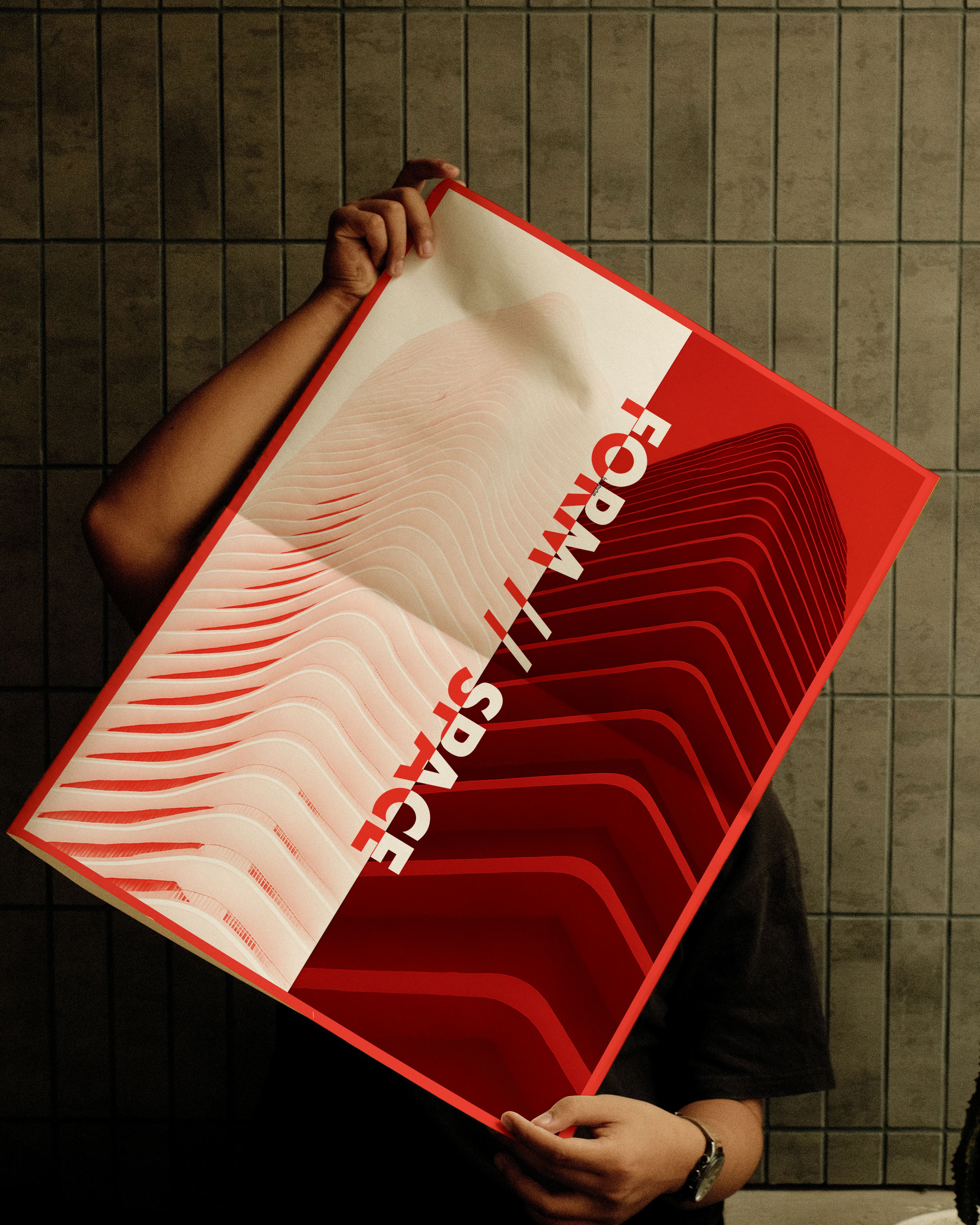
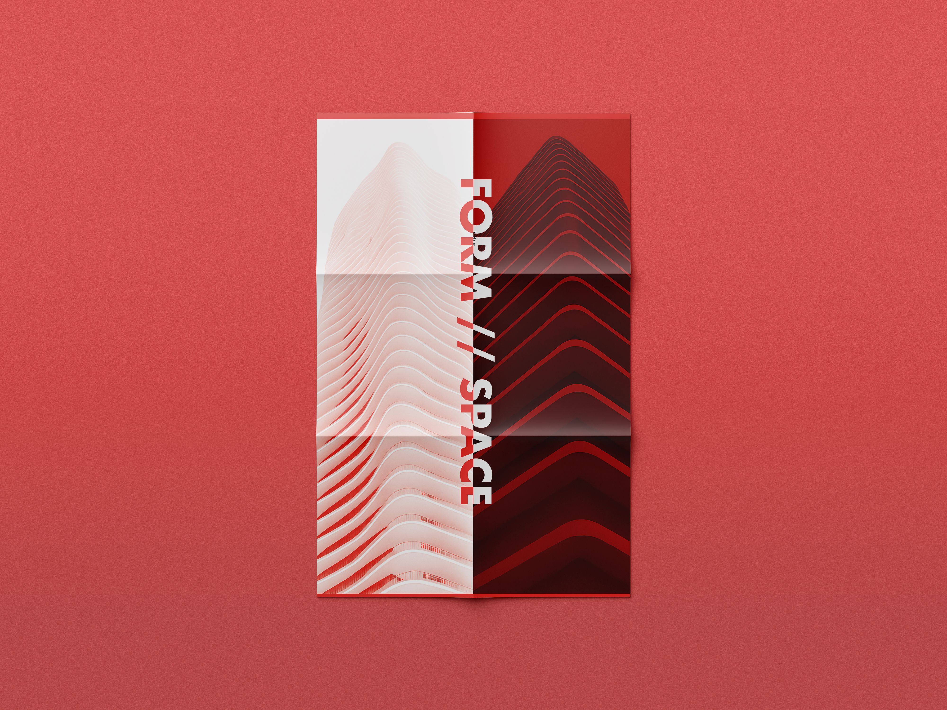
FORM + SPACE (Architecture Issue)
Theme: Exploring structure, spatial balance, and the language of design.
Concept:
FORM + SPACE draws inspiration from modern architecture and the precision of spatial design. The issue’s visual identity focuses on structural form, minimal composition, and geometric balance. The typographic system — led by the motif “form//structure” — mirrors architectural order and materiality.
Design Direction:
Clean grids, modular layouts, and ample white space convey a sense of calm precision, while the inclusion of Zaha Hadid references grounds the issue in visionary, fluid architecture.
Impact:
This issue positions Posterzine as a bridge between print and architecture, expanding its appeal to design professionals and spatial thinkers. It demonstrates how the publication can explore structure and craftsmanship through print, opening opportunities for collaborations with architects, design studios, and material suppliers.
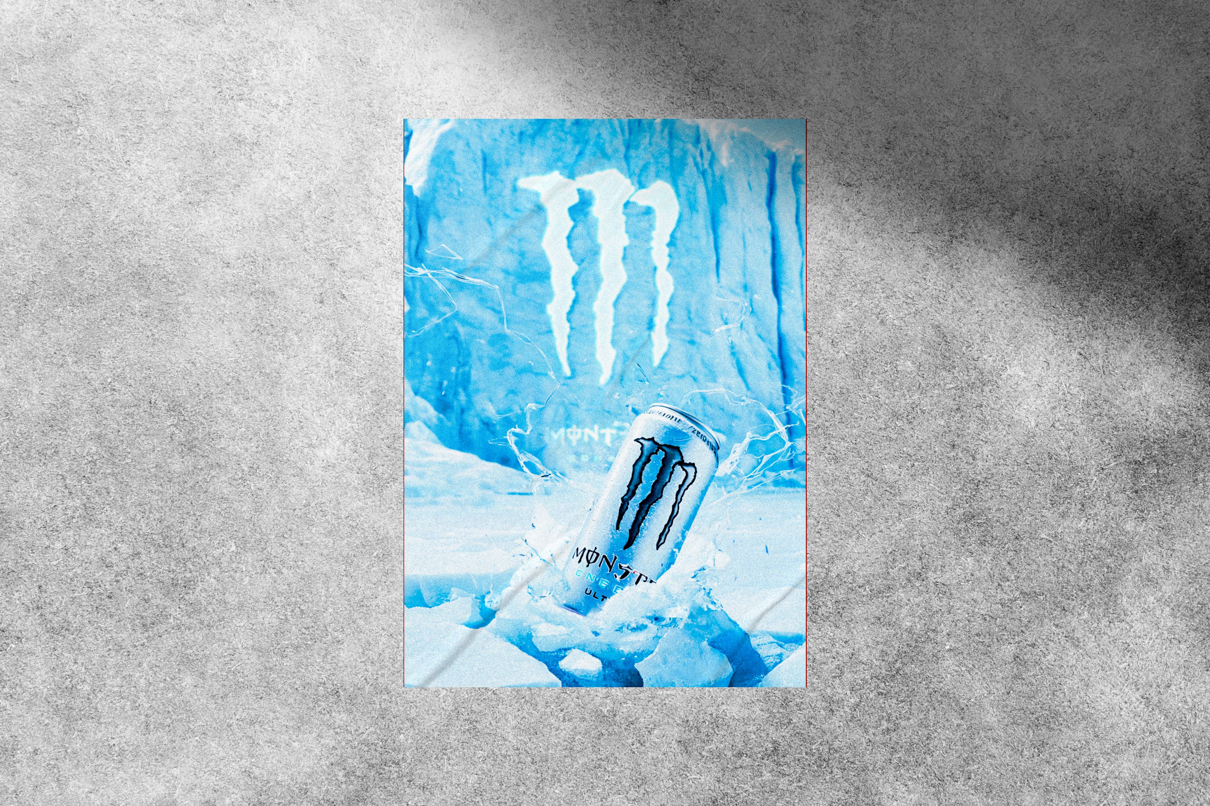
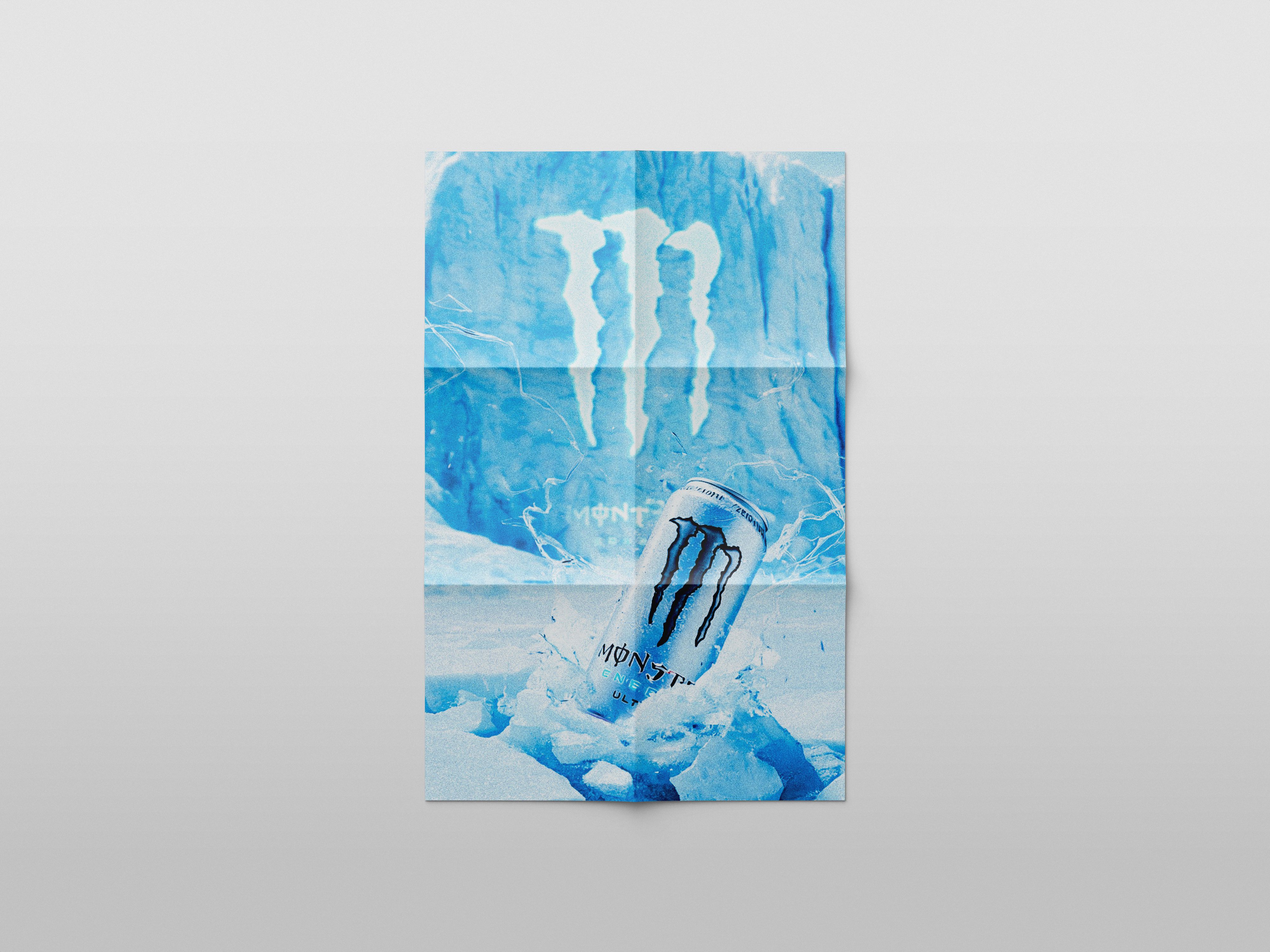
MONSTER ENERGY (Brand Issue)
Theme:
Energy, identity, and cultural branding.
Concept:
This edition explores Posterzine as a vessel for brand storytelling, reimagining the high-energy world of Monster Energy through editorial design. The title “Energy at the Peak” captures motion and intensity, while the visual language — strong contrasts, condensed type, and bold compositions — reflects the brand’s raw dynamism.
Design Direction:
The layout evokes momentum and attitude, merging commercial branding with contemporary print design. The aesthetic remains true to Posterzine’s design integrity while integrating a corporate narrative.
Impact:
This mockup highlights Posterzine’s potential for co-branded or sponsored editions, where creative design meets commercial storytelling. It positions the brand as a print-based platform for lifestyle and culture collaborations, aligning with its long-term licensing and partnership ambitions.


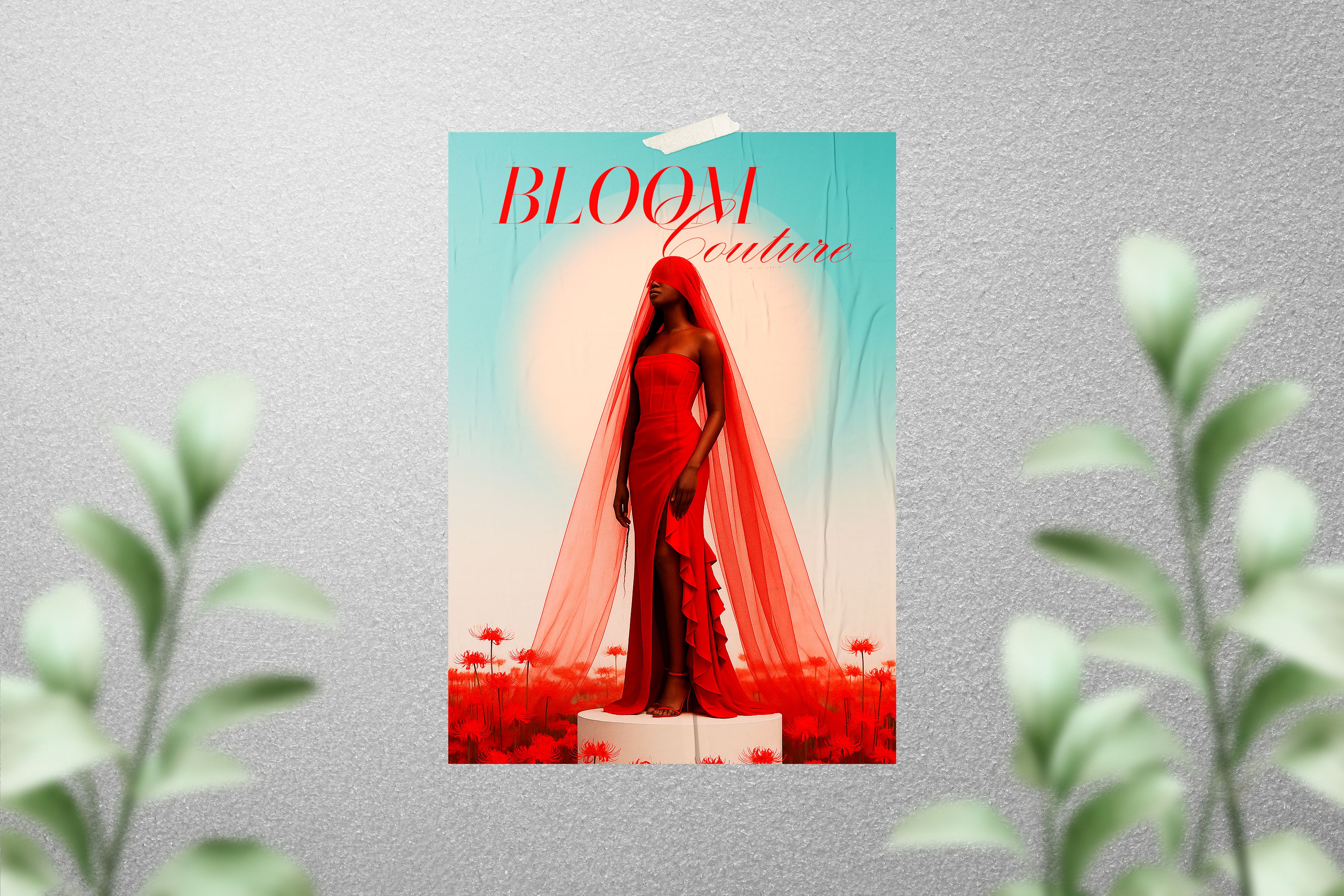
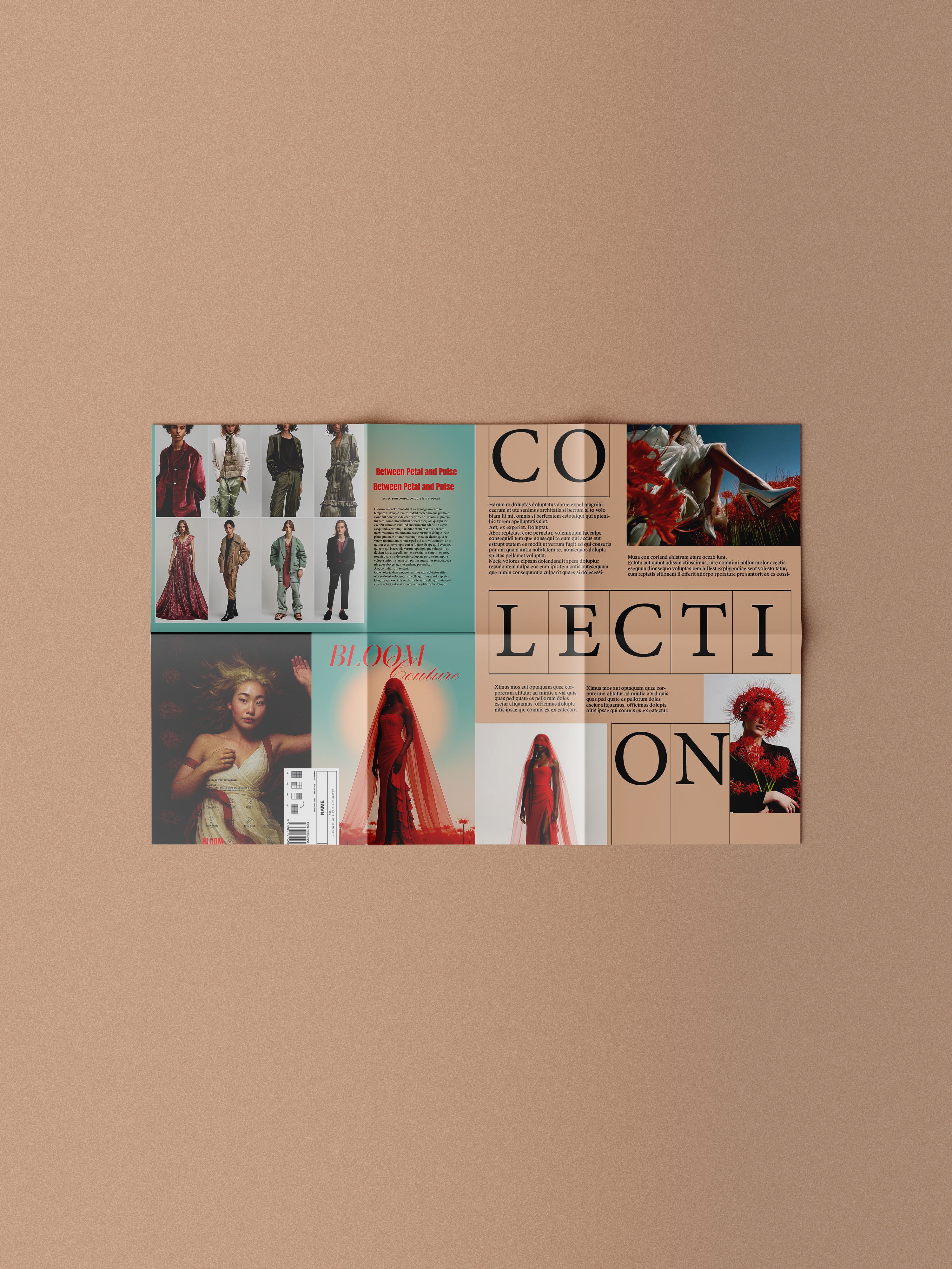
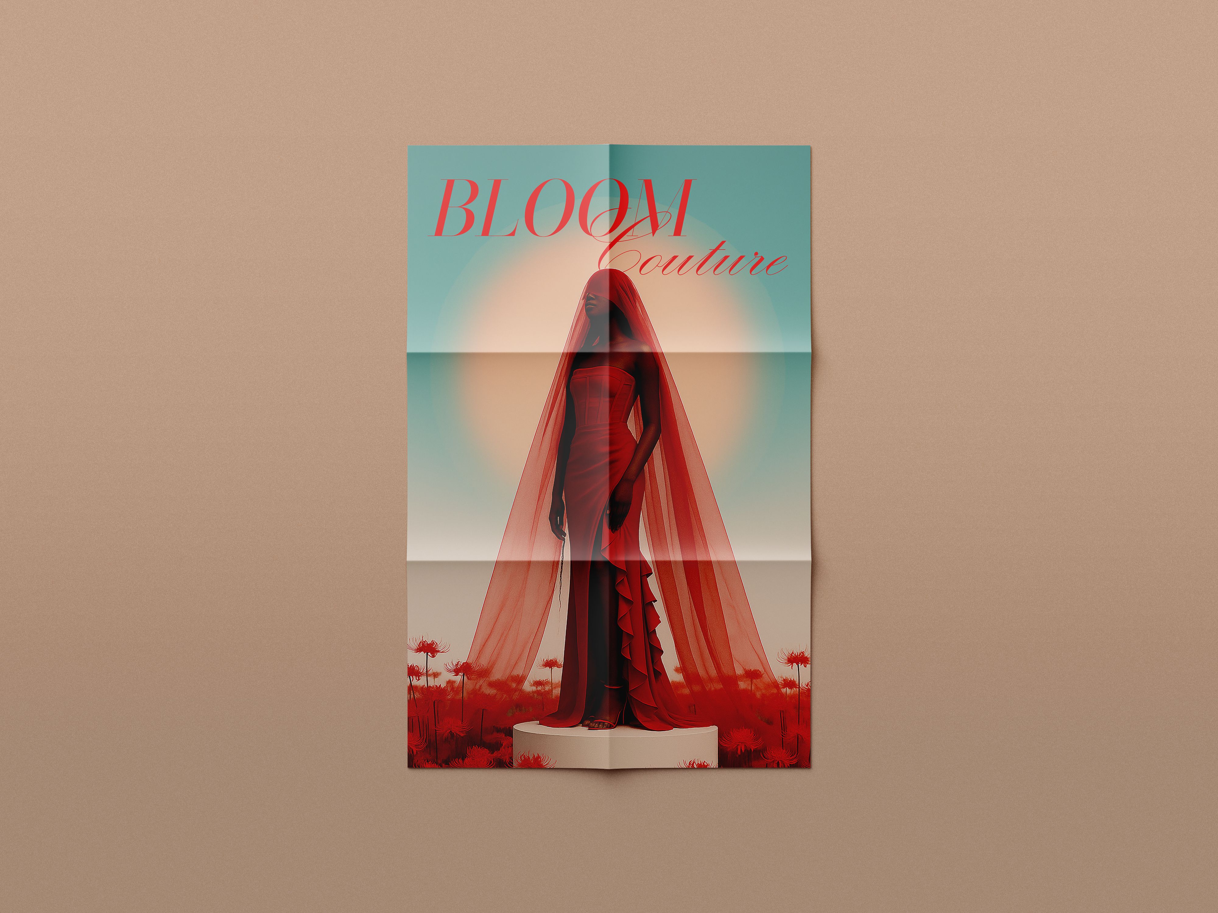
BLOOM COUTURE (Fashion Issue)
Theme:
Nature, growth, and emotional expression through fashion.
Concept:
BLOOM COUTURE explores the connection between organic form and human emotion under the poetic theme “Between Petal and Pulse.” The concept visualises fashion as a living, breathing art form — both structured and fluid.
Design Direction:
The composition blends soft typography and structured rhythm, echoing the duality of fashion’s craftsmanship and creative instinct. The editorial tone is sensual and expressive, bringing a tactile and emotional quality to the zine.
Impact:
This issue extends Posterzine’s reach into fashion and textile storytelling, demonstrating its ability to merge visual design with narrative depth. It creates potential for partnerships with fashion houses, sustainable brands, and cultural publishers seeking to celebrate print as a medium for artistic expression.
Reflection
Together, these three mockups showcase how Posterzine can evolve beyond print into a licensable creative framework — adaptable across industries while retaining its core identity. From structured design to high-energy branding and expressive fashion, the project demonstrates how Posterzine can position itself as a cultural connector between art, design, and commercial creativity.
INSTagram carousel
Concept
The Instagram carousel was designed at 1080 × 1350 px to maximise on-screen impact and maintain a clean, editorial flow consistent with Posterzine’s brand identity. The first slide features an animated video showcasing some of their most popular issues, immediately drawing users in through movement and visual familiarity. Subsequent slides introduce the Posterzine Licensing Launch, highlighting the team’s role as curators, designers, and collaborators within the creative industry. Each frame balances bold typography, structured layouts, and tactile-inspired textures to echo the print heritage of Posterzine while translating it seamlessly into a digital format. The carousel not only promotes the new licensing venture but also celebrates Posterzine’s creative ethos and collaborative spirit.
INSTagram
story
Concept
The Instagram Story video was created in a 1080 × 1920 px vertical format, optimised for mobile viewing and designed to capture attention through movement and editorial flair. Drawing inspiration from Posterzine’s tactile print identity, the story featured animated magazine covers, layered typography, and textured backgrounds that evoked the look and feel of ink on paper. Its purpose was to act as a dynamic teaser for the Licensing Launch — introducing Posterzine’s legacy as curators, designers, and collaborators, while showcasing highlights from past issues. The motion design followed a clean editorial rhythm, using bold typography, smooth transitions, and subtle kinetic effects that mirrored page turns. The sequence concluded with a clear call to action, encouraging viewers to explore the new licensing platform.

Landing page Commision
Overview
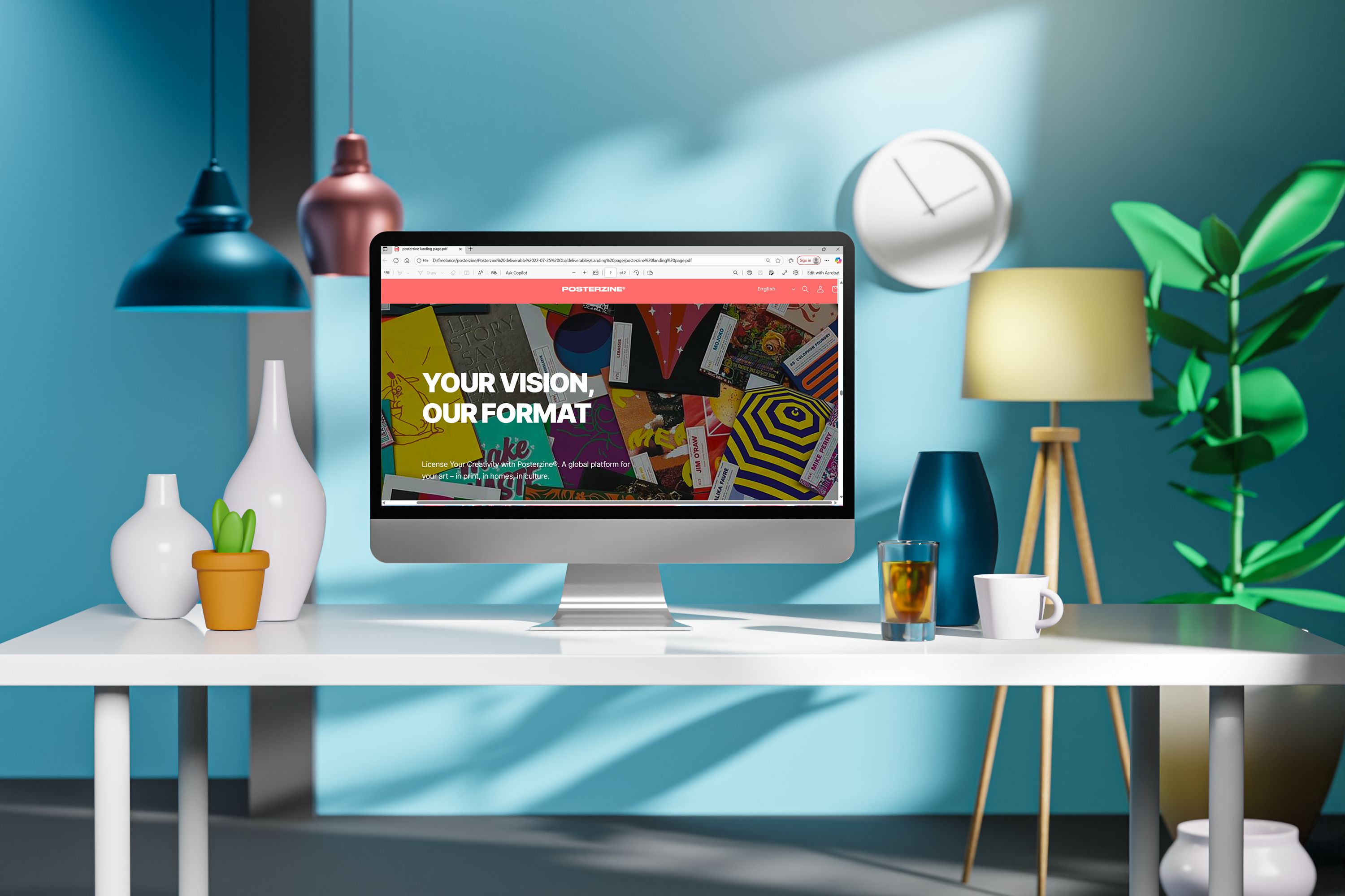
This project was part of the Posterzine® Licensing Launch campaign by People of Print, where I was tasked with creating a digital toolkit and promotional assets to support the introduction of their new licensing programme. The core challenge was a lack of existing material: I needed to design a B2B launch strategy and landing page to sell a highly tactile, physical print format to potential industry partners—without any pre-existing licensed issues to reference as proof-of-concept. To overcome this, the project required not just a digital interface, but the creation of a speculative visual ecosystem to demonstrate the program’s viability. My role involved translating a print-led identity into a cohesive, scrollable web experience that balances editorial aesthetics with commercial intent.
The Digital Pitch: Landing Page Strategy
This project was part of the Posterzine® Licensing Launch campaign by People of Print, where I was tasked with creating a digital toolkit and promotional assets to support the introduction of their new licensing programme. The core challenge was a lack of existing material: I needed to design a B2B launch strategy and landing page to sell a highly tactile, physical print format to potential industry partners—without any pre-existing licensed issues to reference as proof-of-concept. To overcome this, the project required not just a digital interface, but the creation of a speculative visual ecosystem to demonstrate the program’s viability. My role involved translating a print-led identity into a cohesive, scrollable web experience that balances editorial aesthetics with commercial intent.
Wireframe
The wireframing phase focused on establishing a clear narrative flow and hierarchy for the landing page — moving from brand storytelling to service explanation and finally to conversion. I began by mapping out how users would encounter Posterzine®’s identity, understand its licensing offer, and be guided toward enquiry or collaboration. The early wireframes prioritised modular, editorial-style layouts, echoing the visual rhythm of a print magazine while maintaining web usability. Wide margins, bold typography, and asymmetrical grids were used to create a tactile reading experience that felt true to Posterzine’s brand ethos.
I was introducing a completely new business model to users, the wireframing phase could not rely on standard e-commerce layouts. I had to intentionally structure the Information Architecture (IA) to act as a self-serve sales pitch, systematically lowering the barrier to entry for skeptical B2B clients.The wireframing phase focused on establishing a clear narrative flow and hierarchy—moving from brand storytelling to service explanation and finally to conversion. I began by mapping out how users would encounter Posterzine®’s identity, understand its licensing offer, and be guided toward enquiry.
The early wireframes prioritised modular, editorial-style layouts, echoing the visual rhythm of a print magazine while maintaining web usability. Wide margins, bold typography, and asymmetrical grids were used to create a tactile reading experience that felt true to Posterzine’s brand ethos.
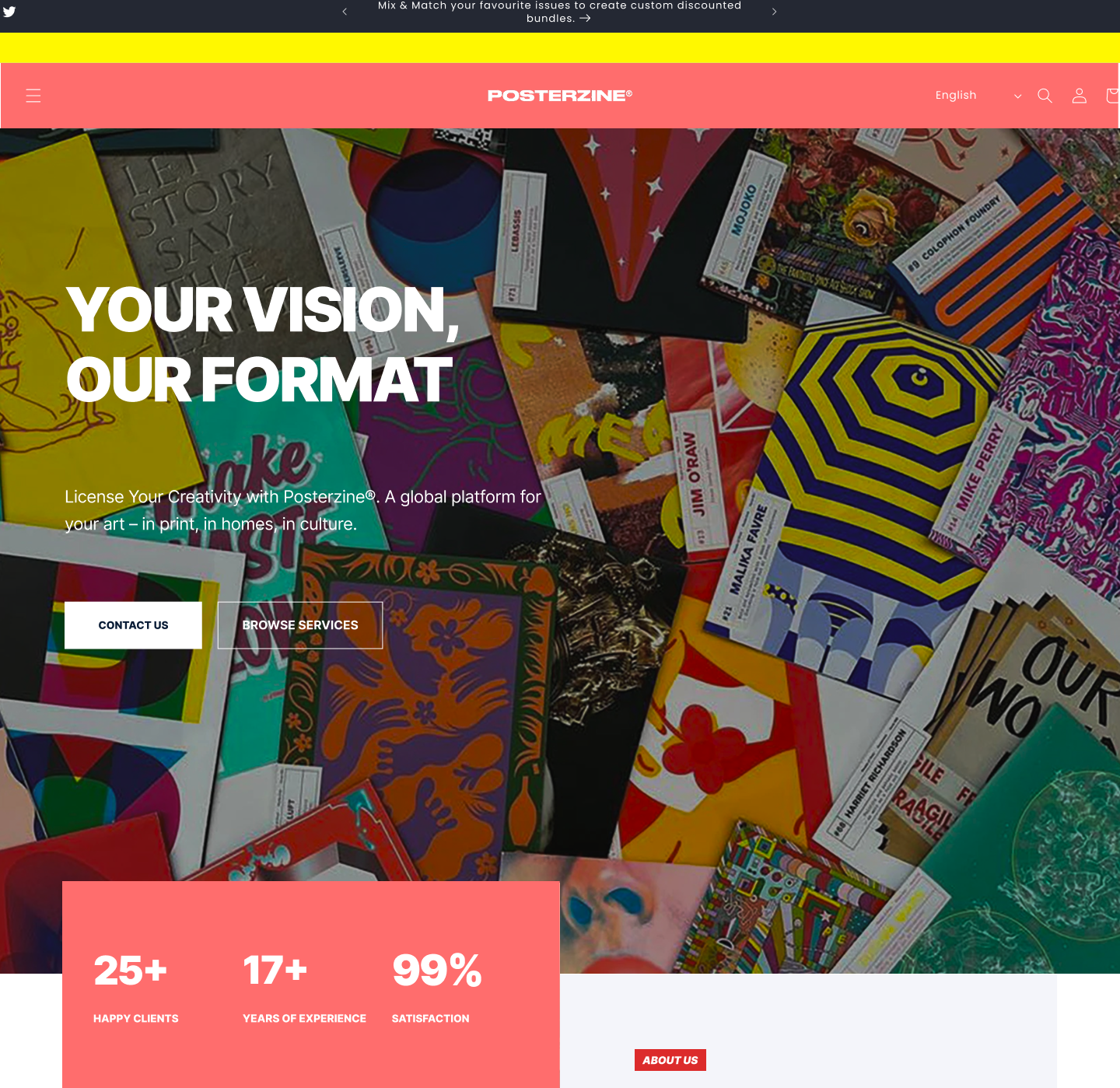
Hero Section
The hero introduces the concept of “License Your Creativity with Posterzine®”, immediately communicating the value proposition: turning creative work into collectible printed art. The hero balances strong visual identity with functional navigation, including buttons such as “Contact Us” and “Browse Services”.This section sets the tone of trust and professionalism, reinforced by supporting stats (e.g., “25+ happy clients”, “17+ years of experience”, “99% satisfaction”) — adding credibility while encouraging engagement from the outset
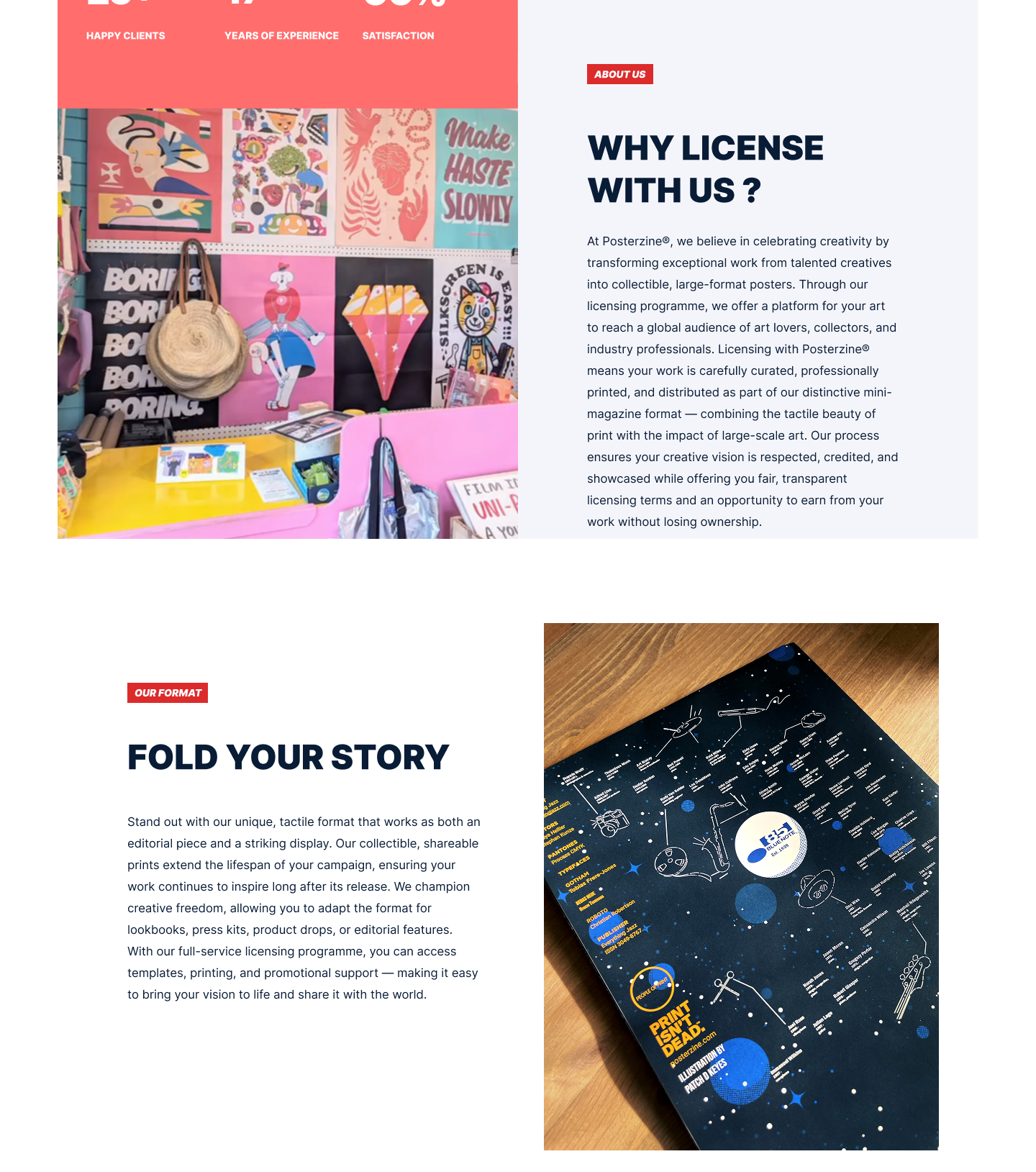
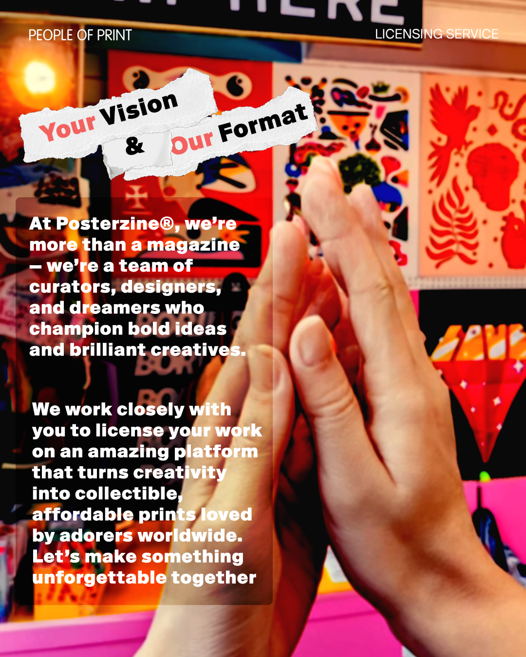
Introduction — “Fold Your Story” & “Why License With Us"
”The introduction establishes the heart of the Posterzine® brand — transforming creativity into collectable, tangible art. Through the “Why License With Us” and “Fold Your Story” sections, I wanted to communicate both the value proposition and the unique product experience of Posterzine’s licensing programme.
The layout balances expressive typography with open white space, mirroring the feel of editorial print spreads. The content highlights how Posterzine® helps artists, designers, and brands bring their vision to life in a physical, fold-out poster format — one that doubles as both a publication and a display piece.
Copy-driven storytelling explains the benefits of licensing — global exposure, fair terms, and artistic freedom — while visual rhythm and alignment maintain a sense of print-inspired craftsmanship. This dual-section introduction sets the narrative tone for the rest of the page: creative, credible, and rooted in design culture.
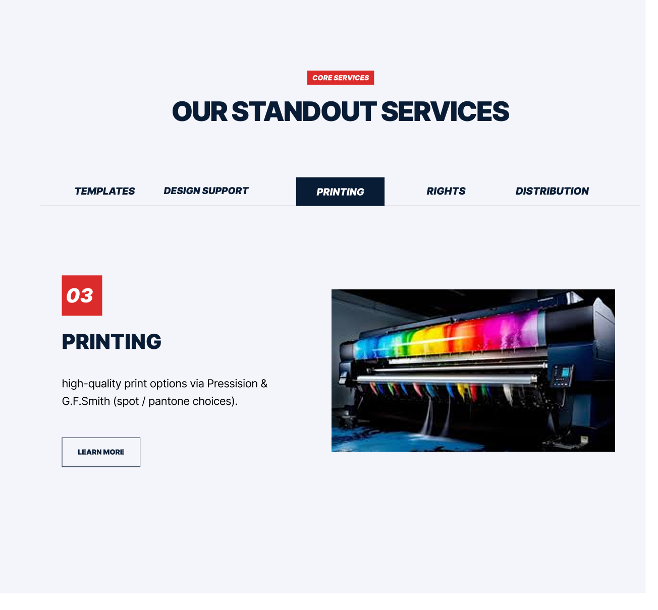
Core Services
The core services area showcases Posterzine’s standout offerings, including template design, support, printing, rights distribution, and licensing management. Each service block is structured for clarity and quick scanning, ensuring potential clients can identify the support level that fits their needs.The inclusion of a “Learn More” button within the printing section encourages deeper exploration, supporting both informational browsing and lead generation.

Pricing & Specification
This section breaks down production specifications and customised pricing plans in an accessible, modular format. Technical details (such as print method, paper stock, Pantone options, and file requirements) are clearly defined, helping clients understand deliverables and professional standards.The pricing tables are organised into three tiers — Starter, Pro, and Prime — each with expandable benefit lists and “Get Started” CTAs. This approach allows flexibility for future pricing integration and scalability across campaigns, reinforcing usability and adaptability of the design.
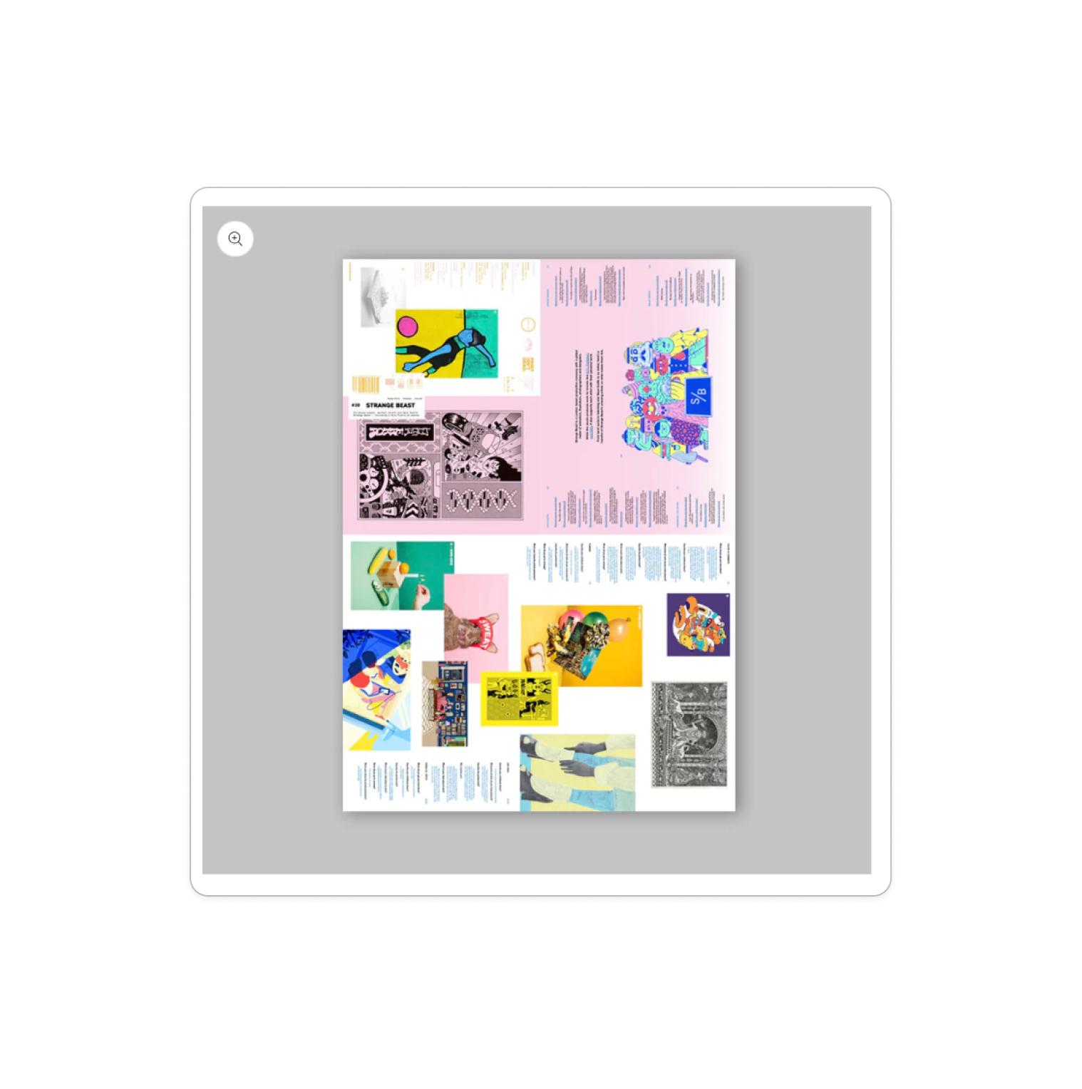
Featured Issue
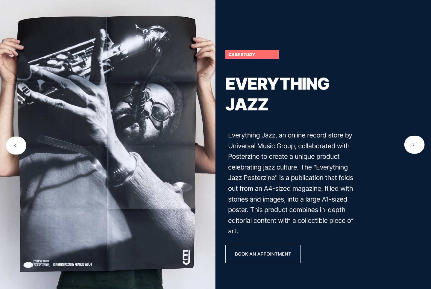
The Everything Jazz feature functions as both a case study and a visual storytelling moment within the landing page’s scrollable carousel. Positioned after the “Process” section, it introduces a real-world example of Posterzine®’s licensing in action — a collaboration with Universal Music Group’s Everything Jazz. I designed this section to feel like turning a page in a magazine: the carousel interaction lets users explore featured projects intuitively without breaking the flow of the landing page. Each slide presents a distinct story, and Everything Jazz demonstrates how the Posterzine® format transforms from a compact A4 publication into an expansive A1 art poster. The layout uses generous imagery, concise editorial copy, and subtle motion to emulate the tactile experience of unfolding the print itself. This section’s intended use is to inspire potential collaborators by showing how diverse creative content can be adapted into Posterzine®’s unique physical format — bridging print, design, and culture in a dynamic, scroll-friendly showcase.
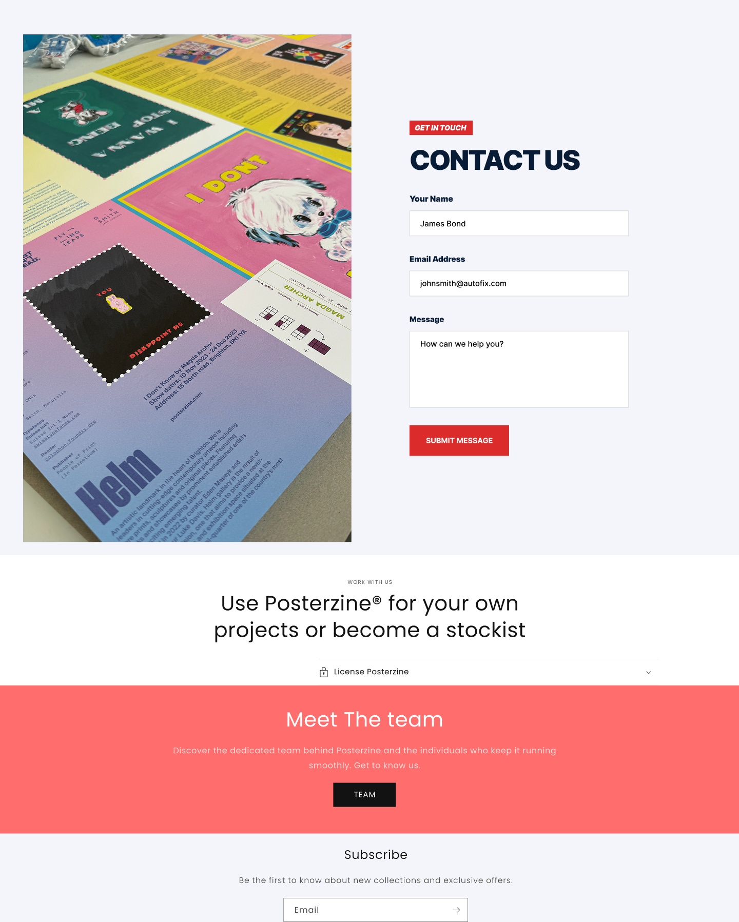
CTA
The call-to-action (CTA) area integrates multiple engagement points — from contact forms and work-with-us prompts to newsletter subscriptions. The inclusion of input fields (name, email, message) reinforces interactivity and provides a direct conversion pathway. Supporting copy such as “Use Posterzine® for your own projects or become a stockist” positions the CTA as both inclusive and opportunity-driven.
Project Outcomes & Delivery
Conclusion
This was a fast-paced, solo initiative executed across a strict four-week timeline. Success for this project was defined by asset readiness and cross-channel cohesion, ensuring the client had a complete, deployment-ready toolkit to execute their B2B outreach.
The Deliverables: Fully designed and prototyped four core asset types: three speculative issue mockups across diverse commercial sectors, a multi-slide Instagram carousel, a promotional story video, and a high-fidelity B2B landing page concept in Figma.
The Baseline Reality: While shifting internal business priorities meant the client did not ultimately deploy the campaign into production, the project successfully established the definitive visual proof-of-concept for how Posterzine's physical product could be effectively marketed as an abstract licensing service.