
Splitwise redesign


trust led redesign

project overview
Splitwise is the world's most popular expense-splitting app. Flatmates, couples and travel groups use it to track shared costs. In 2023, the product changed. Adverts appeared mid-flow. Core features moved behind a paywall. A daily transaction limit was introduced. App Store ratings dropped and users started leaving in large numbers.
This is a trust-first redesign of Splitwise's core iOS experience. Not a visual refresh. A fundamental rethinking of every moment where the app currently breaks the user's confidence.
Goal
The fundamental issue with Splitwise is behavioural rather than visual. The platform has implemented a sequence of deliberate product choices that prioritise revenue over the user experience. Features which were previously free are now gated behind paywalls, and technical errors frequently occur at critical junctures. Furthermore, the aggressive colour palette creates an atmosphere where flatmates feel like debtors in their own homes.
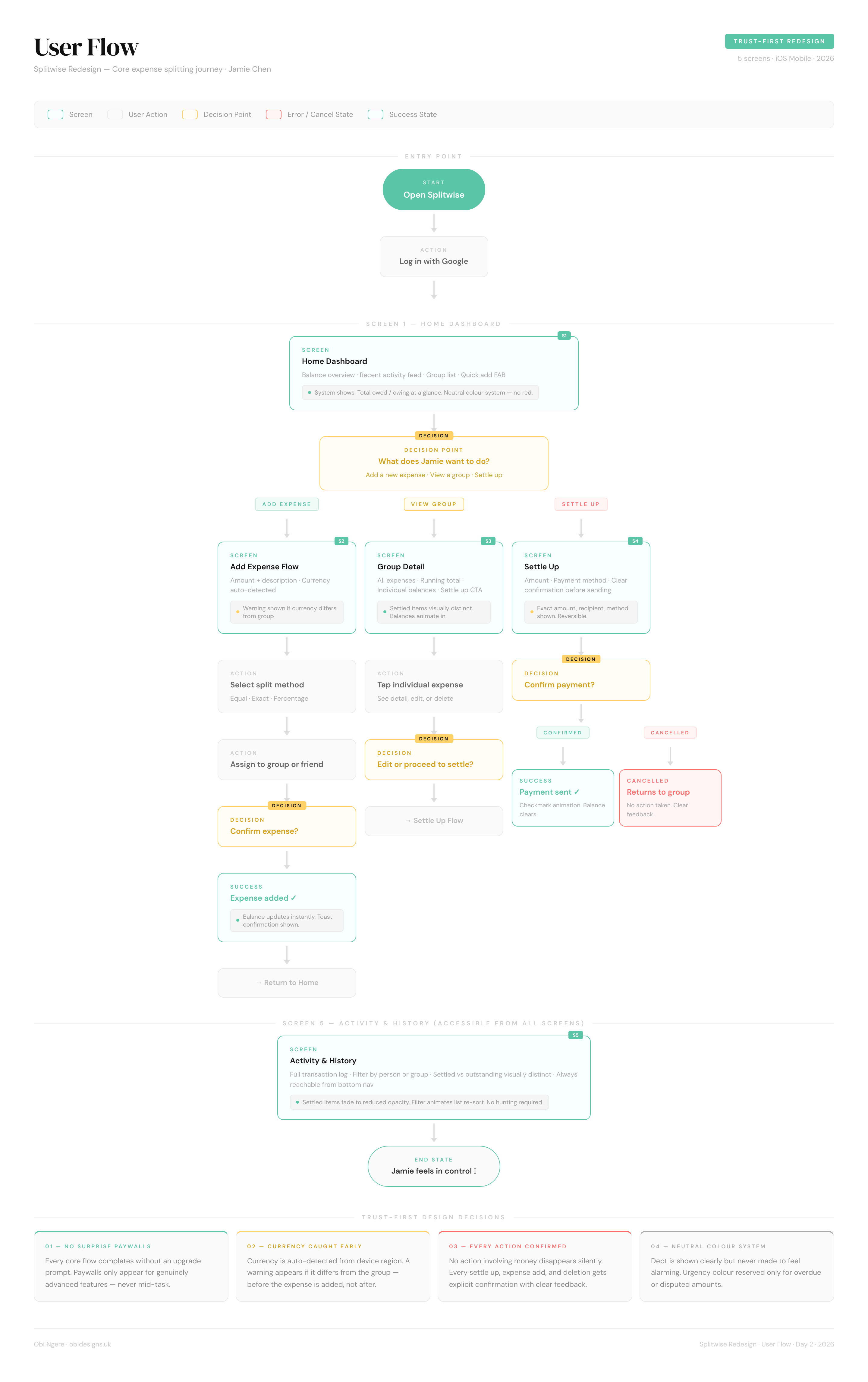
The objective was to redesign five primary screens: the Home Dashboard, Add Expense, Group Detail, Settle Up, and Activity and History. This transformation ensures that every interaction feels transparent, equitable, and reliable. Most importantly, it allows users to navigate these essential functions without encountering a paywall during the moments that matter most.
Three Methods.
One Clear Problem.
Research Overview
The research phase combined first-hand app auditing, heuristic evaluation, and user research from Reddit and the App Store. Three distinct methods pointed to the same underlying failure — Splitwise stopped designing for users and started designing for revenue.
.png)
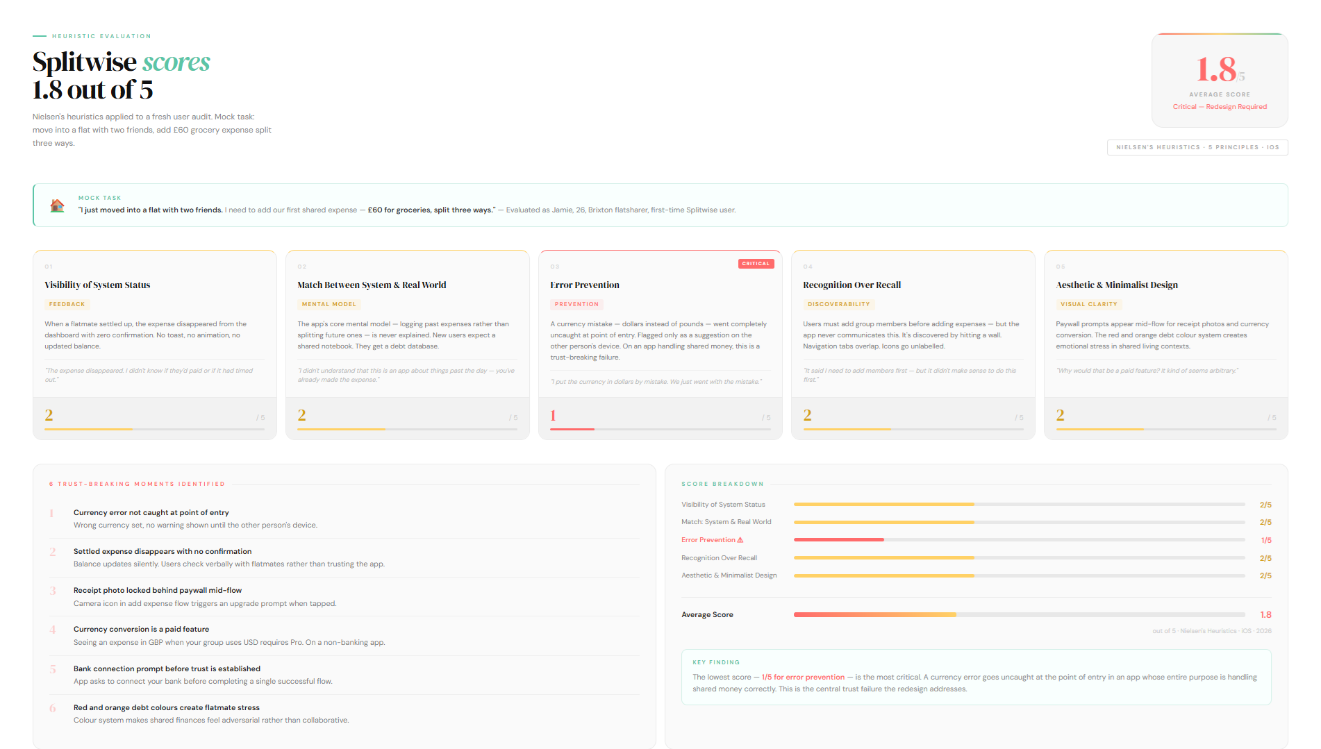
Heuristic Evaluation
I completed a fresh sign-up and worked through a core mock task: move into a flat with two friends, add a £60 grocery expense split three ways. I scored the experience against five Nielsen heuristics. The average score was 1.8 out of 5.The lowest score, 1 out of 5, was for error prevention. A currency mistake made during expense entry went completely uncaught at the point of input. The app flagged it on the other person's side as a suggestion to convert.
On an app that handles shared money between real people, that kind of error going undetected is a fundamental trust failure.Reddit threads and App Store reviews from 2024 and 2025 confirmed that the frustration isn't isolated. It's widespread and consistent. Three themes came up across every source.
Analysis of Reddit threads and App Store reviews throughout 2024 and 2025 confirms that these frustrations are systemic rather than isolated. Three consistent themes emerged:


Competitor Analysis
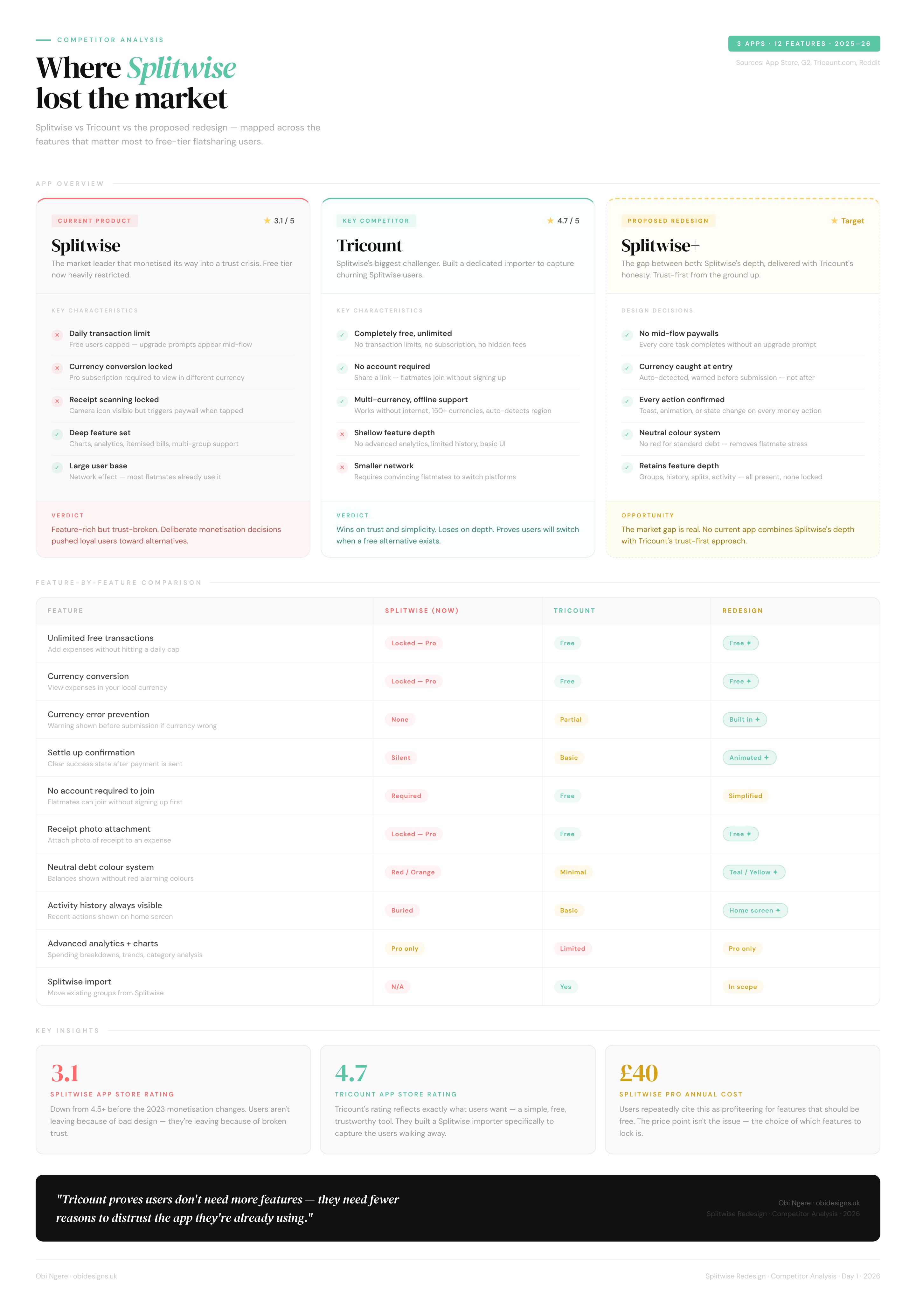
What Tricount Got Right
Tricount, a direct Splitwise competitor, recently added a dedicated Splitwise import feature. Their positioning was straightforward: no limits, no adverts, no fees. They understood exactly why users were leaving and moved to capture them directly.Tricount wins on trust and simplicity.
Splitwise wins on feature depth. This redesign sits in the gap between both. Splitwise's depth, delivered with Tricount's honesty.
From Research to Direction
Defining the problem
Three research insights shaped every design decision that followed. Trust was broken by deliberate product choices, not bad design. The app gives users no confirmation at the moments involving money. And the free tier is now so restricted it no longer works as a complete product.
How might we redesign Splitwise so that splitting expenses feels fair, transparent and trustworthy, without interrupting users at the moments that matter most?
User Needs
Transparency at every step
Jamie needs to know exactly what happened after every action. Expense added, confirmed. Payment sent, confirmed. Balance updated, visible immediately. No disappearing screens, no ambiguous states, no hunting through tabs."The expense disappeared from my dashboard. I didn't know if they'd paid or if it had just timed out."
A free experience that feels complete
Paywalls should exist for genuinely advanced features, not for viewing an expense in a different currency or taking a photo of a receipt. Every core flow must work without interruption."Watch an ad to add an expense? A daily transaction limit? Seriously?"
Emotional neutrality around debt
Jamie lives with these people. Seeing red and orange every time she opens the app creates low-level stress about money that damages flatmate relationships. The app needs to present balances clearly without making anyone feel like a debtor.
"It might cause a certain amount of drama or stress with your flatmates — knowing you're seeing a bunch of red things showing you owe."
User Flowchart
FROM STRUCTURE TO SCREEN
Building a trust-first design systemBefore designing a single screen, I established a visual language that would reinforce trust at every interaction. The colour system uses teal for positive states (settled, received), yellow for outstanding balances, and red sparingly, only for debts requiring action. This replaces Splitwise's aggressive red-orange debt system that made shared living feel adversarial.
Components built for clarity and reusabilityThe component library consists of twelve core elements utilised throughout the application. These include Primary Buttons with teal default, outline secondary, and red destructive variants. Input Fields feature inline error states for currency warnings, while Split Pills allow for equal, exact, or percentage distributions. Toast Notifications provide feedback for success, warnings, or errors, and Expense Rows use yellow, teal, or red border states to indicate status.
Each component communicates its state immediately. For example, the yellow currency warning banner employs a persistent yet dismissible pattern that prevents errors without interrupting the user journey. To reinforce reliability, the Settle Up success screen features an animated checkmark that draws on with a satisfying 0.8 second ease out curve. This transforms a simple confirmation into a moment that builds trust rather than serving as a silent update.
Typography
Colour Palette
Colour as a Functional Language, Not DecorationThe palette serves three key roles: communicating state, guiding visual hierarchy, and setting emotional tone. Teal represents settled or positive states, yellow indicates outstanding but neutral situations, and red signals that action is required—specifically when you owe something. Red is never used for general debt, only for “you owe” states, ensuring the meaning stays precise and psychologically accurate. Yellow, by contrast, communicates that someone owes you, without urgency.Primary teal is used strategically to draw attention to calls to action while maintaining visual balance. The overall tone is calm and composed, achieved through dark backgrounds paired with teal accents, avoiding the stress often associated with financial interfaces.Purple (#BF5AF2) is reserved exclusively for Pro features, creating a clear and consistent upsell signal without disrupting the free-tier experience.Surface colours follow a clear elevation system inspired by iOS dark mode: #1C1C1E for base cards, #2C2C2E for raised elements, and #3A3A3C for areas requiring the highest contrast.


REDESIGN REEL & pROTOTYPE
SCREENS BREAKDOWN
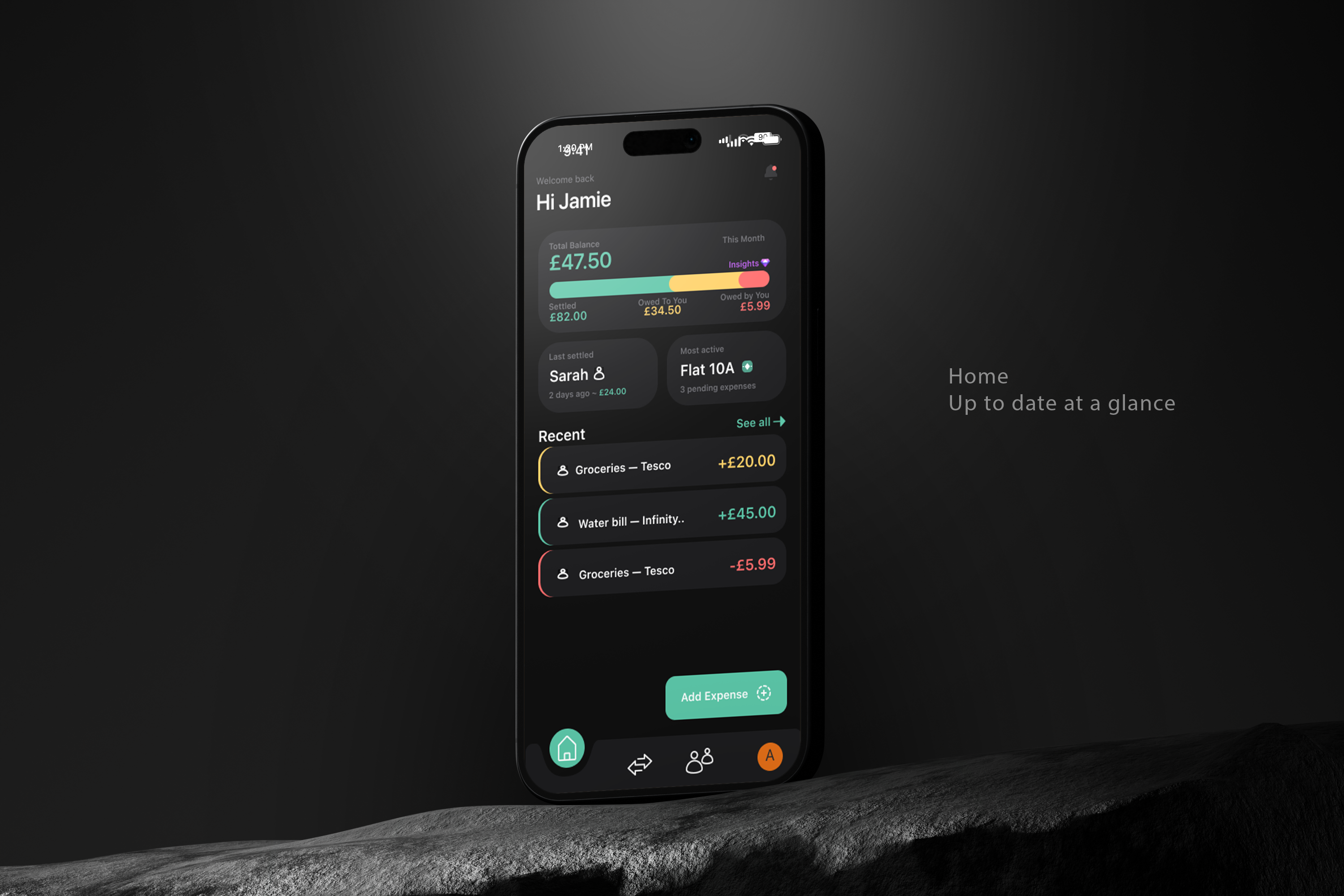
01 - HOME
Balance visualization shows the full picture
The horizontal progress bar breaks down settled, owed and owing in one view, eliminating the mental arithmetic Splitwise forces on users. The balance card uses a three-colour system (teal for settled, yellow for owed to you, red for you owe) that maps directly to the labelled amounts below it. The "Most active" group surfaces immediately, and the Recent feed uses context-aware colour coding on the left border, making each transaction's direction readable without parsing text.
02 — ADD EXPENSE
Currency validation happens at point
of entry
The yellow warning banner flags currency mismatches immediately, before the expense is added. This directly addresses the 1/5 error prevention score from the heuristic evaluation. The banner is persistent but non-blocking: users can override if the mismatch is intentional, but they cannot miss it. The split preview shows exactly how much each person owes in real time, removing ambiguity before confirmation.
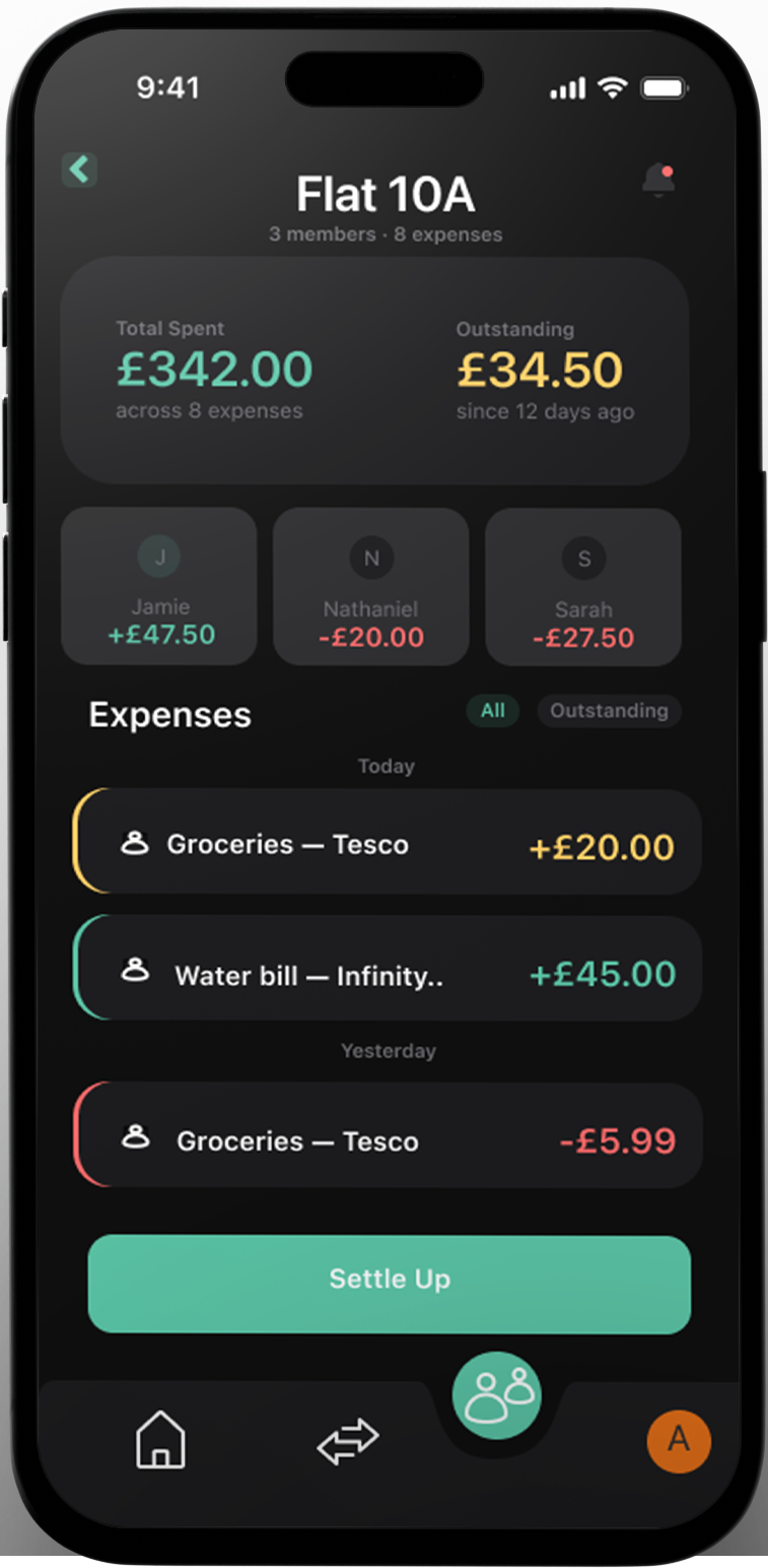
03 — GROUP DETAIL
Individual balances visible at group level
Each member card shows their net balance within the group so you understand the full picture before settling. The Settle Up button is pinned above the nav bar in an elevated container, always visible and never buried. The expense feed uses the same left-border colour system as the home screen, creating a consistent visual language across the entire app.
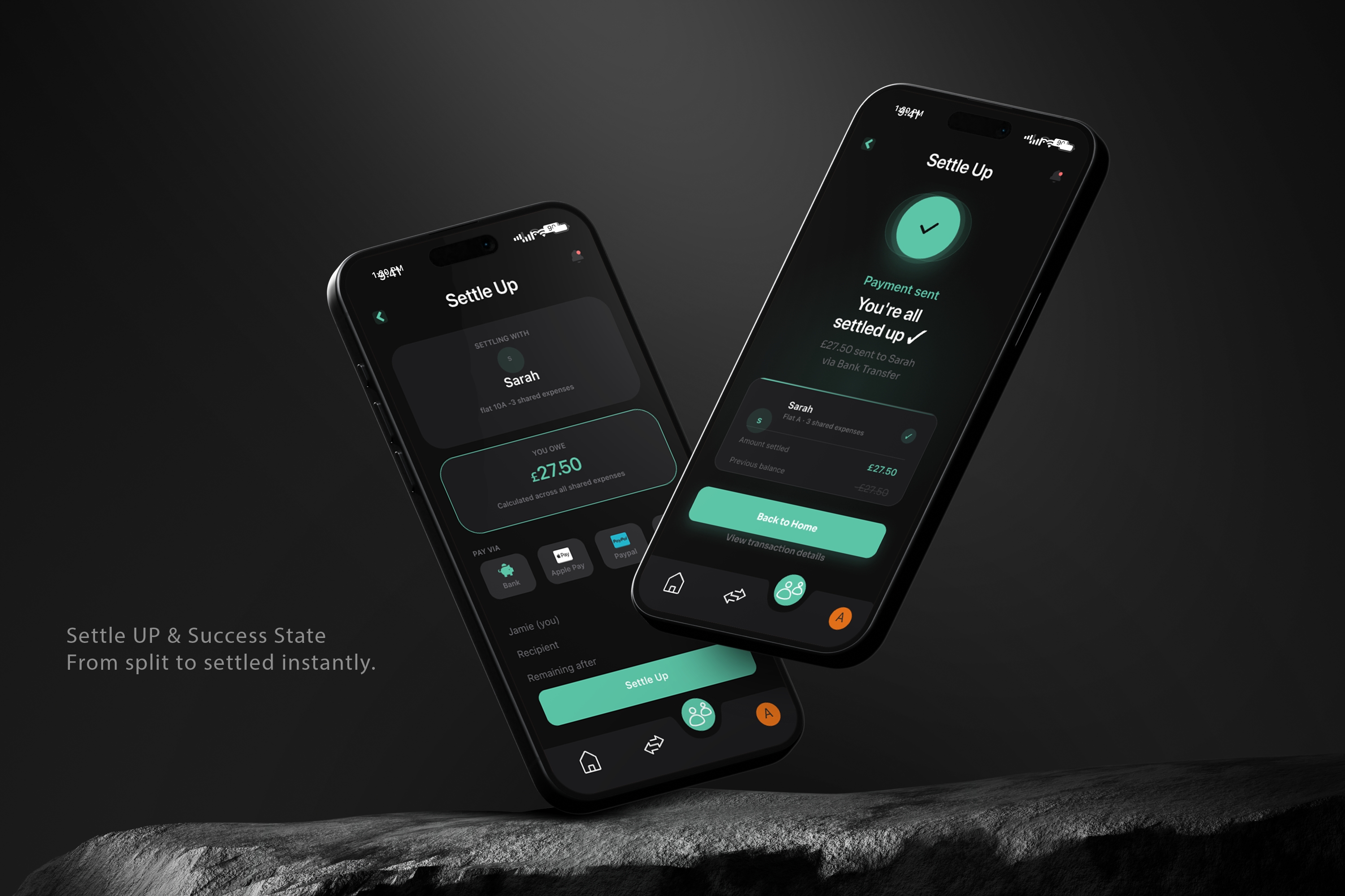
04 — SETTLE UP (PRE-PAYMENT)
Payment transparency with multiple options
Bank transfer, Apple Pay, PayPal and manual request all live in the same flow, removing friction at the point of settlement. The summary breakdown shows exactly what you're paying, who you're paying, and what remains after. The "Remaining after" row tells users the outcome before they confirm, eliminating the surprise factor that eroded trust in the original app.
05 — SETTLE UP (SUCCESS)
Settlement confirmation with full transaction details
he success state shows what happened: £27.50 sent to Sarah via bank transfer. The breakdown card displays the previous balance, amount settled and updated balance. Users now get proof the action completed instead of a silent balance update. The checkmark animation and explicit confirmation message turn settlement into a trustworthy moment rather than an uncertain one.
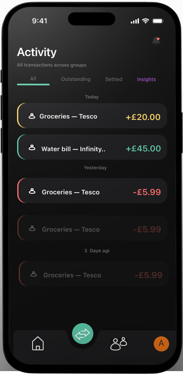
06 — ACTIVITY
Chronological feed with smart filtering
All transactions across groups in one view, filterable by Outstanding, Settled and Insights. The left-border colour system maintains expense context without cluttering the interface. Date headers group by recency for quick scanning. Users do not need to remember where things are; they can filter to exactly what they need.
07 — INSIGHTS (PRO UPSELL)
Pro features unlock after core flows succeed
Spending charts, category breakdowns and CSV export live behind the paywall, but only appear contextually when users tap the purple Insights button. This repositions Pro as enhancement, not obstacle. Free users see what they would get, understand the value, and can dismiss it without interruption. Currency conversion and basic functionality stay free. Genuine power-user features earn the upgrade.
Reflection
The most important decision I made on this project was choosing the trust angle before opening Figma. Every designer who has tackled Splitwise on Behance has started with screens. Starting with research meant every design decision had a specific user problem behind it, not just a visual preference. When a hiring manager asks why the currency warning sits where it does, or why the balance card uses yellow instead of orange, there is a documented answer rooted in real user frustration.If I had more time, I would have run moderated usability testing on the prototype with three to five real Splitwise users.
The heuristic audit gives expert perspective. Watching a real 26-year-old try to split a grocery bill gives truth. I would also have explored an onboarding flow that addresses the mental model mismatch: the fact that Splitwise is an app for logging past expenses, not splitting future ones. Something that trips up new users and was never addressed in this redesign.The project took nine days from research to prototype. The design system, the research methodology and the trust-first framing are all things I would carry directly into a professional product team.